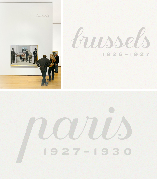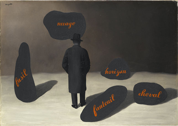
How MoMA made its own René Magritte typeface
The museum's graphic designer took the painter's writing and transformed it into blockbuster signage
Artists inspire the staff at New York's Museum of Modern Art in all manner of ways, yet few have had so direct an influence over Sabine Dowek, the museum's senior graphic designer, as René Magritte.
The Belgian surrealist, whose blockbuster retrospective Magritte: The Mystery of the Ordinary, 1926–1938 is drawing to a close at MoMA this week, worked as a poster designer and commercial artists before turning to fine art, and continued to include uniform lettering in some of his most famous pieces.
Writing on the MoMA Inside/Out blog, Dowek says that when the curators of MoMA's Magritte exhibition "suggested incorporating Magritte's beautiful lettering style-or a version inspired by it-for the title wall design, I was, of course, very excited."
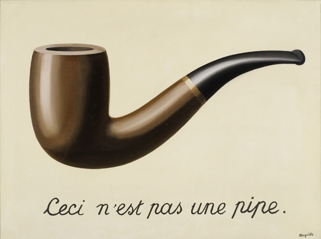
Dowek says she collected together examples of the lettering, which appears in such paintings as La Trahison des images (The Treachery of Images), L'Apparition (The Apparition), and Le Masque vide (The Empty Mask), in order to come up with her own font.
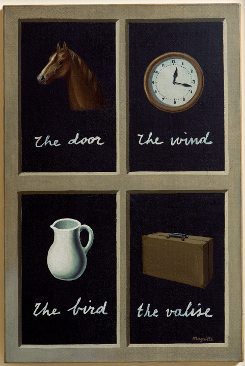
"There were many variations from one artwork to another," Dowek says, "some had greater contrast of thick and thin, others were more condensed, and there were perceptible shifts in stroke weight-largely due to the proportion of sizes between the brush and the letters he was drawing.
Nevertheless, Dowek was struck by the uniformity of many of the characters. "The letter "p," for example, the most notably unique character in his alphabet, always had an open counter, and looked like an "n" with a prolonged stem. The end of the letter "s" consistently looped inwards into a soft twirl that finished with a small, delicate node."
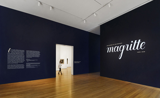
Dowek says it took sometime to capture this typographically. "When I got stuck on how to resolve a particular transition between letters-for example, between the "B" and "r" in Brussels-I would go back to my research and sure enough, Magritte was there to give me a helping hand."
Her finished font, which features in the exhibition's signage, isn't an exact copy of the painter's lettering, but more an insightful graphic updating. Catch it while you can; the show closes on 12 January. For more on this go here. For greater insight into Magritte consider our highly affordable introduction to the artist. For more on the development of graphic design, pick up our magisterial Archive of Graphic Design. Buy them from the people who made them, here.
