Remembering the LA Olympics
Rauschenberg and Hockney's pop art creations for the 1984 games go on show in Switzerland
Those of us old enough to remember the 1984 Los Angeles Olympic Games probably recall the games’ sporting achievements – such as Carl Lewis’ four gold-medal wins – and its Hollywood-style stunts – including rocket man Bill Suitor flying into the opening ceremony on a jet pack. Yet there were other visual highlights which are on show once again this month, at the Olympic Museum in Lausanne, Switzerland.
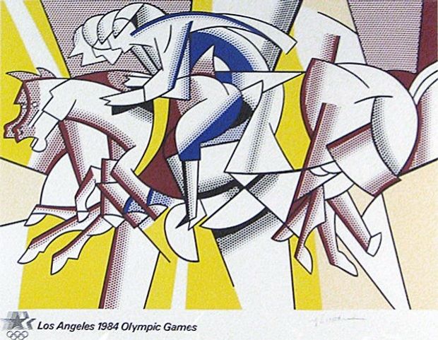
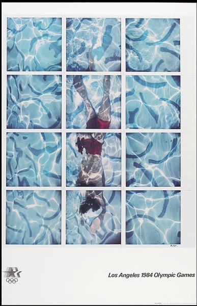
The museum is displaying 15 posters created specifically for the 23rd Olympiad in its Art Lounge. The posters – mostly by American artists - answered the committee’s brief to depict the theme of sport and the Olympics. David Hockney’s shows an aerial view of a swimmer under rippling water broken up into 12 squares, and Roy Lichtenstein's is equestrian in subject.

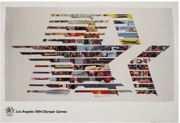
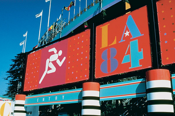
Robert Rauschenberg's fragmented photographic collage called “Star in Motion” was selected as the Games’ official poster. Meanwhile, Arnold Schwartzman illustrated cycling, Marvin Rubin did gymnastics, Ken Parkhurst the shot put, Rod Dyer wrestling, and Don Weller athletics. The look created for the Games was the work of the late and hugely influential Deborah Sussman and her studio Sussman/Preiza. Her graphics and bold colour palette are on show through 38 photos taking during the event, which accompany the posters.

“The 1980s were marked by non-conformism, eccentricity, audacity and joie de vivre,” say the exhibition organisers, “All these elements are clearly expressed in the stylistic vocabulary chosen by the organisers of the 1984 Games in Los Angeles, with its fun approach and acid colours.”
Hence the show’s title: Los Angeles 1984 - Colorful LA. Rather than resorting to the US’s national colours, Sussman opted for the colours of the Pacific rim, with hot magenta, vermillion, aqua and chrome yellow playing a major part. The look and feel has a little in common with the California Light and Space movement, but Sussman says the true inspiration lay a little further away. “The cultures of the Pacific rim, especially Mexico and Japan were appropriate to the culture of Los Angeles; while India and its attitude towards ‘celebration' was of enormous influence on what we did,” she added.

The show runs until 23 November and you can learn a little more about it here. For more on Rauschenberg, go here; for insight into the pop art, consider our books, and for a great overview of graphic design from the invention of the printing press right up until today, buy The Phaidon Archive of Graphic Design.