Can you guess what this new Pentagram logo is for?
Paula Scher turns pictures into words in this new identity for a Canadian healthcare charity
Sometimes a picture doesn't need to speak a thousand words, but instead say two or three carefully chosen ones. Consider Milton Glaser’s 1977 I heart NY logo, or Paul Rand’s 1981 rendering of International Business Corporation’s initials as Eye-Bee-M.

While IBM and NYC are a little more profile than The Heart and Stroke Foundation of Canada, Pentagram, the leading independent graphic communications agency, has designed a simple, two-part decal for the charity that’s equally world class.

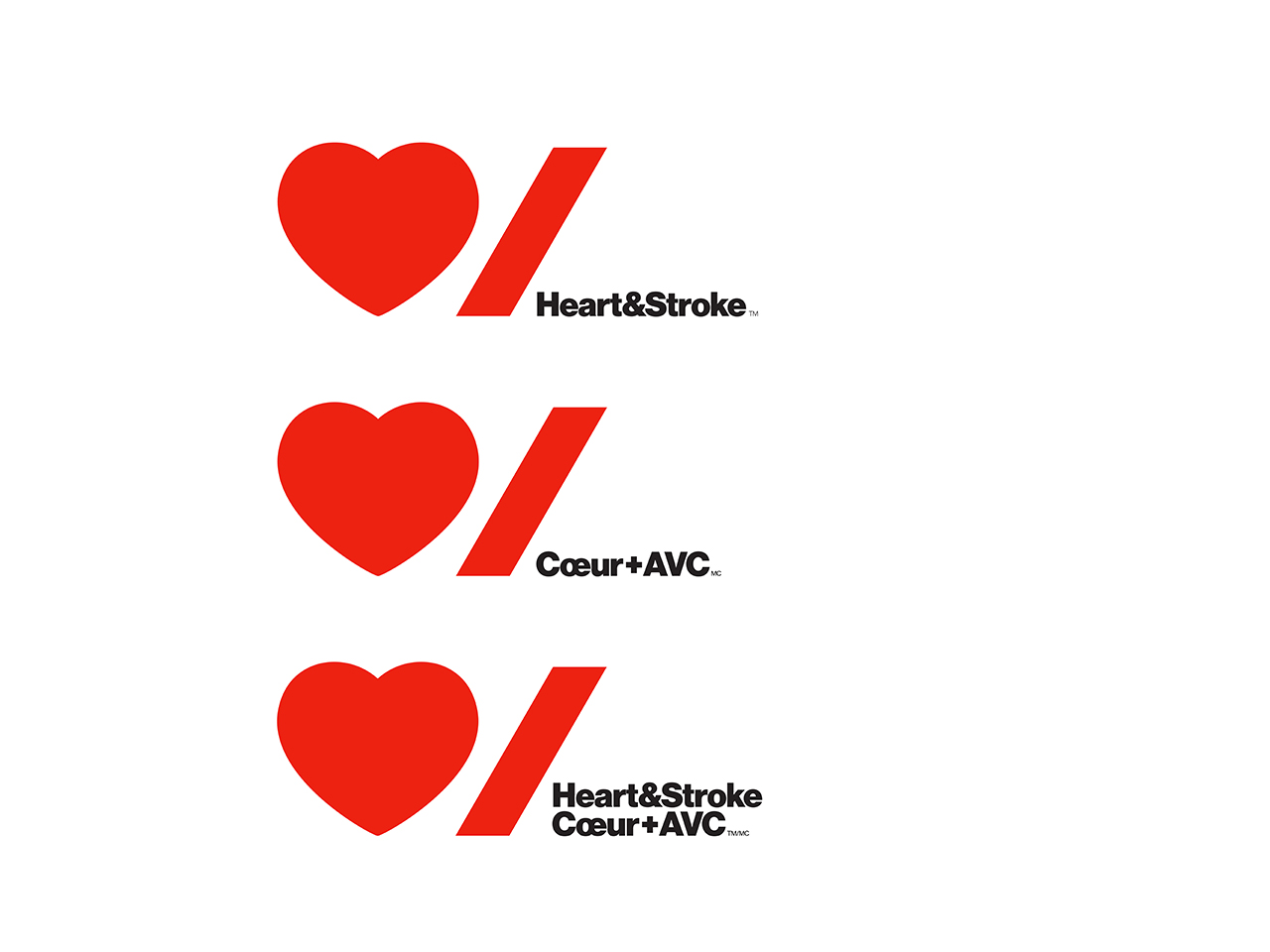
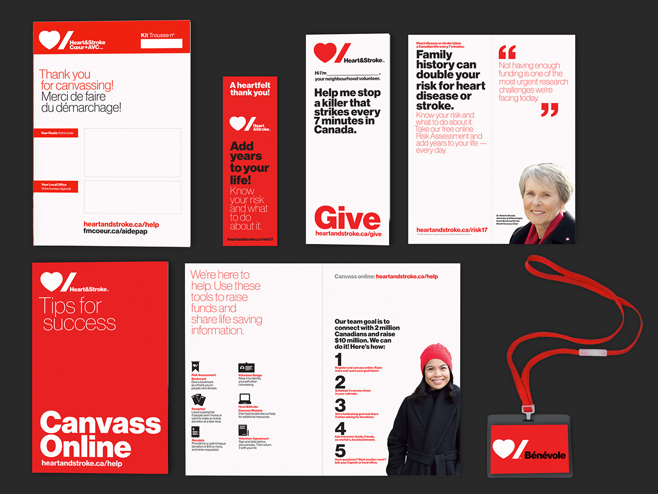
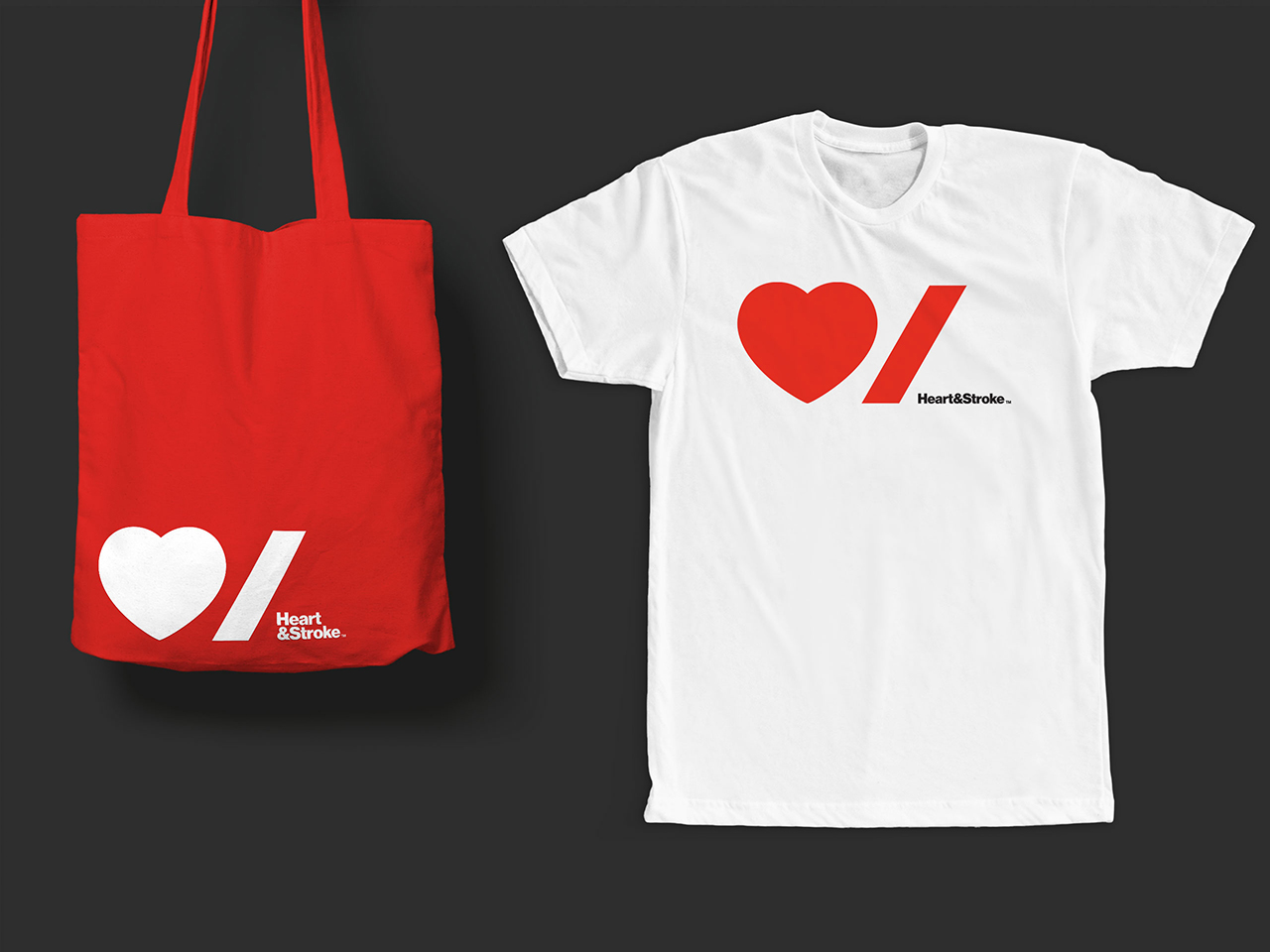
Agency partner Paula Scher created the 2016 identity, which coincides with an overall brand refresh for the charity, which has now shorten its name to Heart & Stroke. Scher’s heart icon plus the forward slash convey this new name perfectly for Canada’s English-speaking population, and while official bilingualism requirements aren’t absolutely met – the stroke/stroke homophone doesn’t work in French – Pentagram says the identity “represents a feeling anyone who has been impacted by a heart attack or stroke has felt –an abrupt punctuation, exactly how stroke interrupts life suddenly,” while adding that the new design, which will be used across Heart & Stroke’s branding, from letter heads to tote bags, “accommodates both English and French by stacking the words in a lockup with the logo.”

For more branding get our book Marks of Excellence; for great graphic works from Gutenberg’s press up until the present day order a copy of The Phaidon Archive of Graphic Design; for more on Paul Rand, consider this book; and to learn about the British design maverick who co-founded Pentagram take a look at our Alan Fletcher books.