Take a deep dive into blue – the world’s most popular colour
Our new book Iro: The Essence of Colour in Japanese Design, provides an exquisitely focused insight into this internationally appealing pigment
Blue remains the most beloved shade on the colour wheel, no matter where you are on earth. Numerous surveys return blue as the colour most respondents across the globe favour most. A 2007 study by the University of Texas indicated that blue rooms lead to greater work productivity; and both Pantone and the paint giant Dulux picked different shades of blue as their colour for 2022. Indeed, the shade proved so popular last year that the ingredients used in the composition of blue paint ran into short supply, as home decorators emptied the shelves.
Yet, which blue should you go for? Whether choosing an outfit, picking out furniture, or repainting your walls, many warn against selecting too cold or austere a blue. Rather than focus on the global picture, perhaps you should go deep on blue via Iro: The Essence of Colour in Japanese Design.
In this new book author and academic Rossella Menegazzo, Associate Professor of the History of East Asian Art at the University of Milan, tells the remarkable tale of the unusual shades favoured in Japanese applied arts and design – from the purple dyes of antiquity, through to the pigments used by contemporary greats such as Issey Miyake, Naoto Fukasawa and Shiro Kuramata.
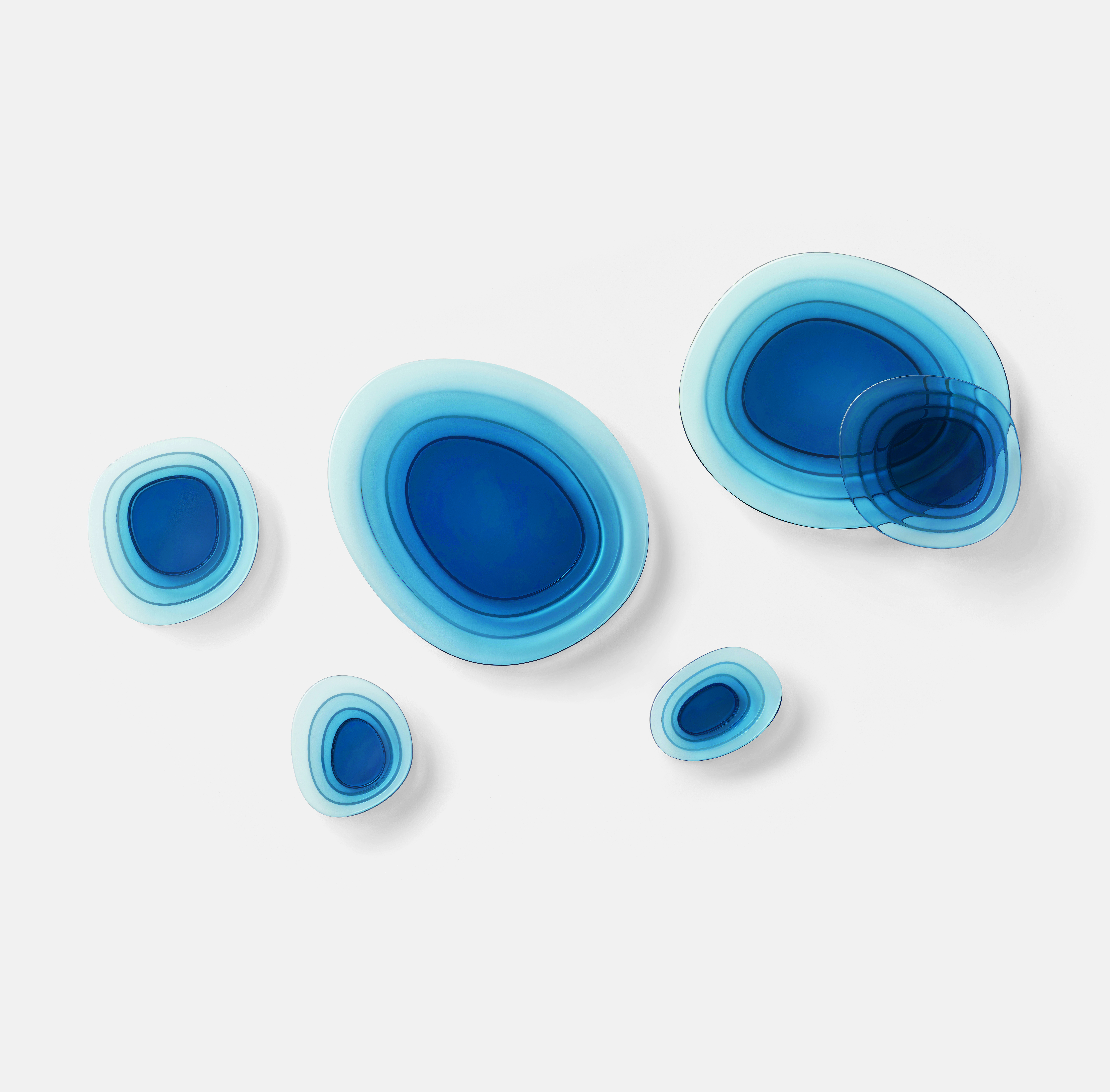
Each colour listed is accompanied by at least one example product, and all are arranged in colour order, which makes for an easy, and fascinating reading experience. Some colours are deeply embedded in the country’s culture. Consider Koiai or Deep Indigo Dye. “Used here as a prefix, the character for koi- or koki- (meaning ‘deep’ or ‘dark’) denotes the tone of ai (indigo dye), the character that follows it,” says Menegazzo. “Koiai was the blue dye most widely used for working-class clothing during the Edo period (1603– 1868), to the point that foreigners referred to it as Japan blue.” This was the colour chosen by Japanese design studio nendo when creating the Soft Pond series of crystal trays for Atelier Swarovski in 2019 (above).

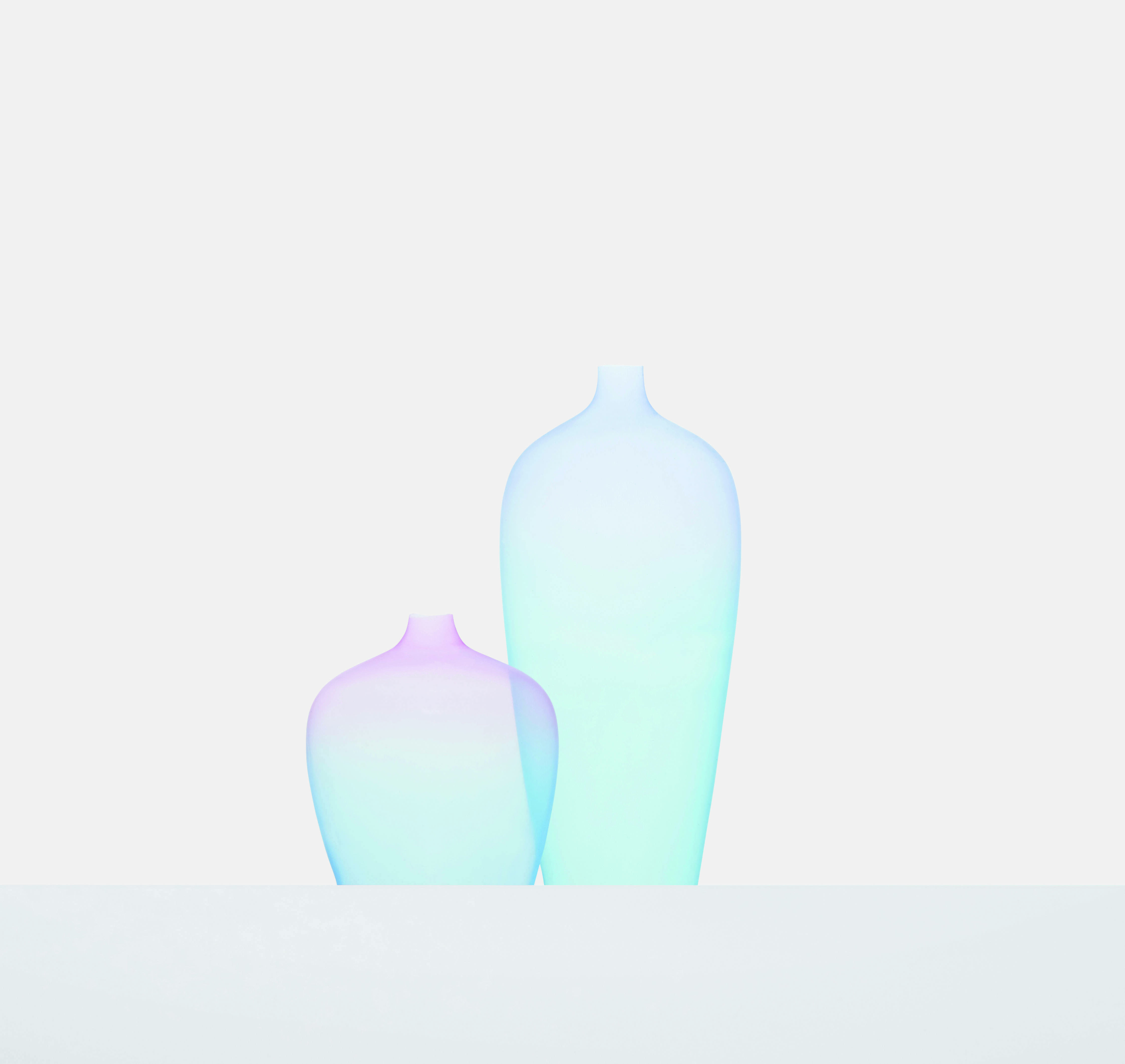
Others, such as Tākoizu Burū, or Turquoise Blue, are more recent additions to Japan’s decorative arts. “This hue refers to the blue colour of turquoise gemstones, as distinct from the alternative green veining that the mineral may display,” writes Menegazzo. “Due to it being imported, turquoise is a relatively modern name based on the English term, so it is written by transliterating the Japanese-style pronunciation of turquoise using the katakana phonetic syllabary. While commonly used in pottery and jewellery today, it is not part of Japanese craft tradition.” The relative novelty of shade didn’t prevent nendo from using it in these silicon Jellyfish Vases created in 2017 and displayed during Milan Design Week.

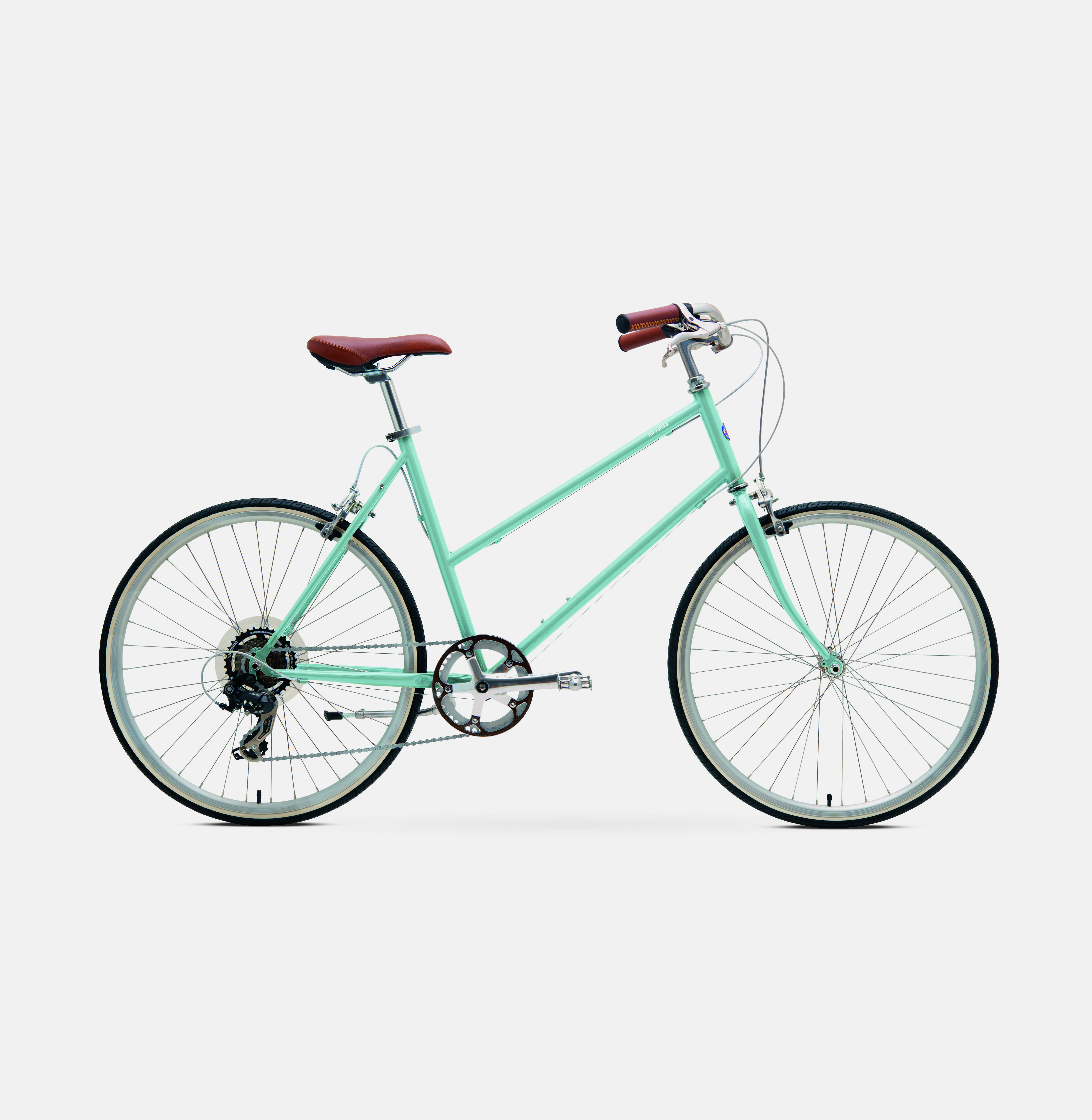
For a take on blue with a deeper lineage, try Usumizuiro or Light Aqua. “A pale blue reminiscent of the colour of clear water, this tone sits between aijiro (whitish-indigo blue) and kamenozoki (peeping, (indigo blue)), shades that are obtained by rapidly dipping fabrics or paper in indigo-blue dye,” explains our author. “Demonstrating its durability within Japanese culture, mizuiro is cited as a colour for summer clothing in sources dating as far back as the Heian period (794–1185).”
This bicycle, created by Tokyobike, only dates from 2016, but it certainly seems made for cooling summer rides, wherever you are in the world. To find out more about colours such as these, order a copy of Iro here.
