What to say about black and white – the timeless monochromatic colourway
Is it ancient, or new? Or even a proper colour scheme at all? Understand black and white a little better, via our book Iro
In the West, when we say we ‘see things in black and white’, we mean we overlook nuance. In Japan, they view things a little differently. As Rossella Menegazzo, Associate Professor of the History of East Asian Art at the University of Milan, says in her new book, these two extremes of the colour spectrum come with many different variations and associations. In her introduction to Iro: The Essence of Colour in Japanese Design, Menegazzo writes that this new book tells the story of both the bounteous pigments present within the Japanese peninsula, as well as its tendency towards reducing that range “to only neutral tones, to either black or white, most commonly seen in the fields of contemporary design and architecture, but also in sumi-e ink painting.” She goes on: “one could argue that this move towards neutrality stems from Zen philosophy and the idea of creating a space that is free for individual expression.”
Yet tracing black and white’s place place in Japanese design is problematic, as they are not “considered colours in the technical sense, nor featured in the DIC Color Guide series,” explains the author. What’s more, strong, pure blacks and whites are not easy to produce in times gone by, and are part of a range of pigments belonging “exclusively to the modern industrial world, associated with chemical and mechanical, if not digital, processes,” she explains.
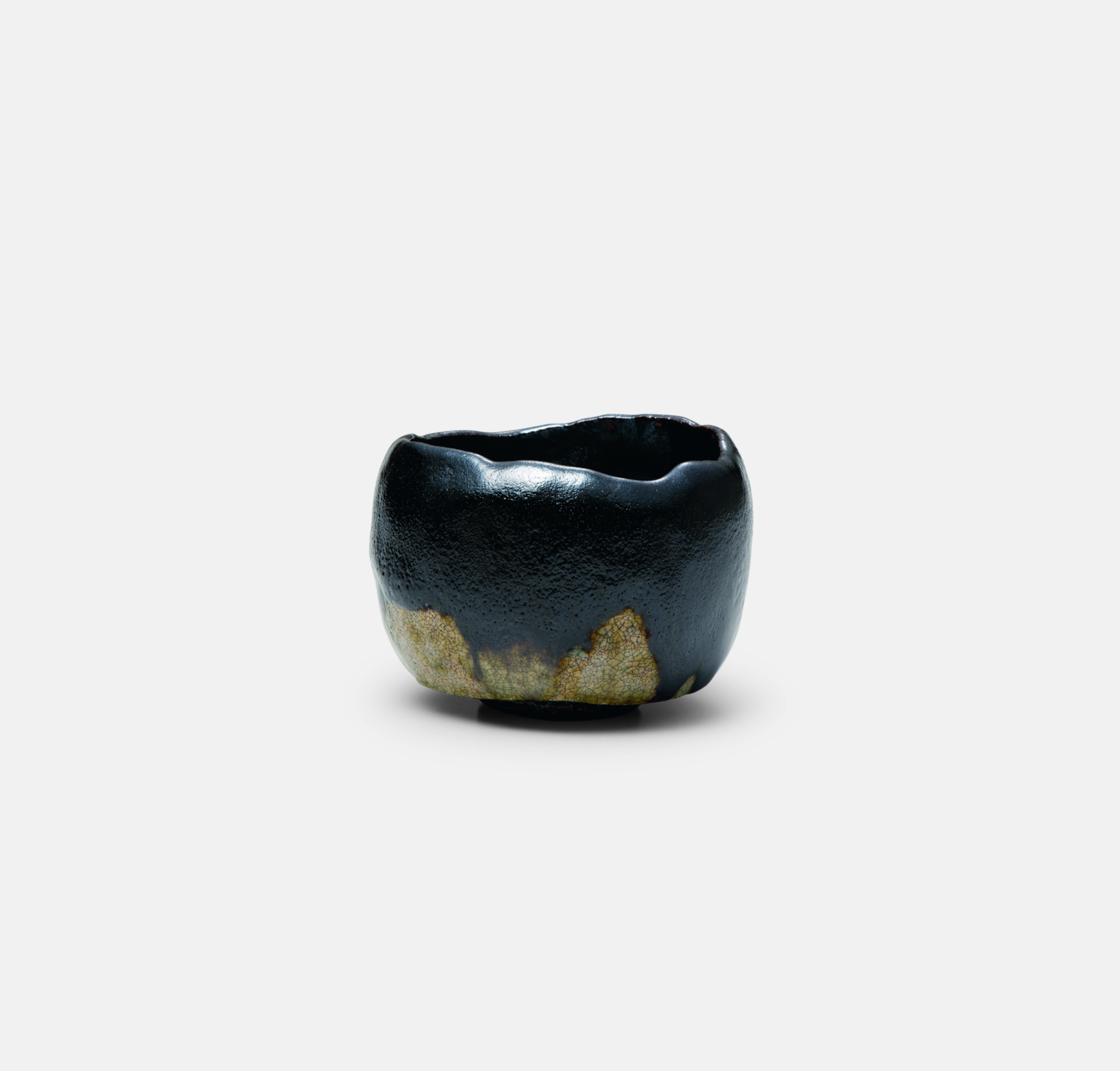
In spite of these difficulties, Iro does shed fresh light on black and white, which are, the author admits, fundamental to Japan’s visual identity. When Menegazzo comes to examine these polar ends of the visible light spectrum, she finds more variation and detail than we might see in the West. “Kuro (black) is not technically a colour and there is no such thing as absolute or pure black,” the author writes in the entry for black. “For this reason, it is not considered a traditional Japanese colour. Kuro is instead used to categorise a variety of blacks belonging to Japanese culture and experience, as identified by different terms. As well as sumiiro (ink black), there is also shikkoku (lacquer black), known in the West as Japan black for the paintwork of the first Ford car; ankokushoku, which denotes the black of night; and nurebairo, the glossy black of feathers used to describe Japanese women’s raven-black hair. In Japanese painting, black comprises all the colours of nature; in contemporary Japanese industrial design, it is one of the most widely used pigments.” This black, hand-moulded raku tea bowl (above) is a perfectly imperfect example to accompany the entry.

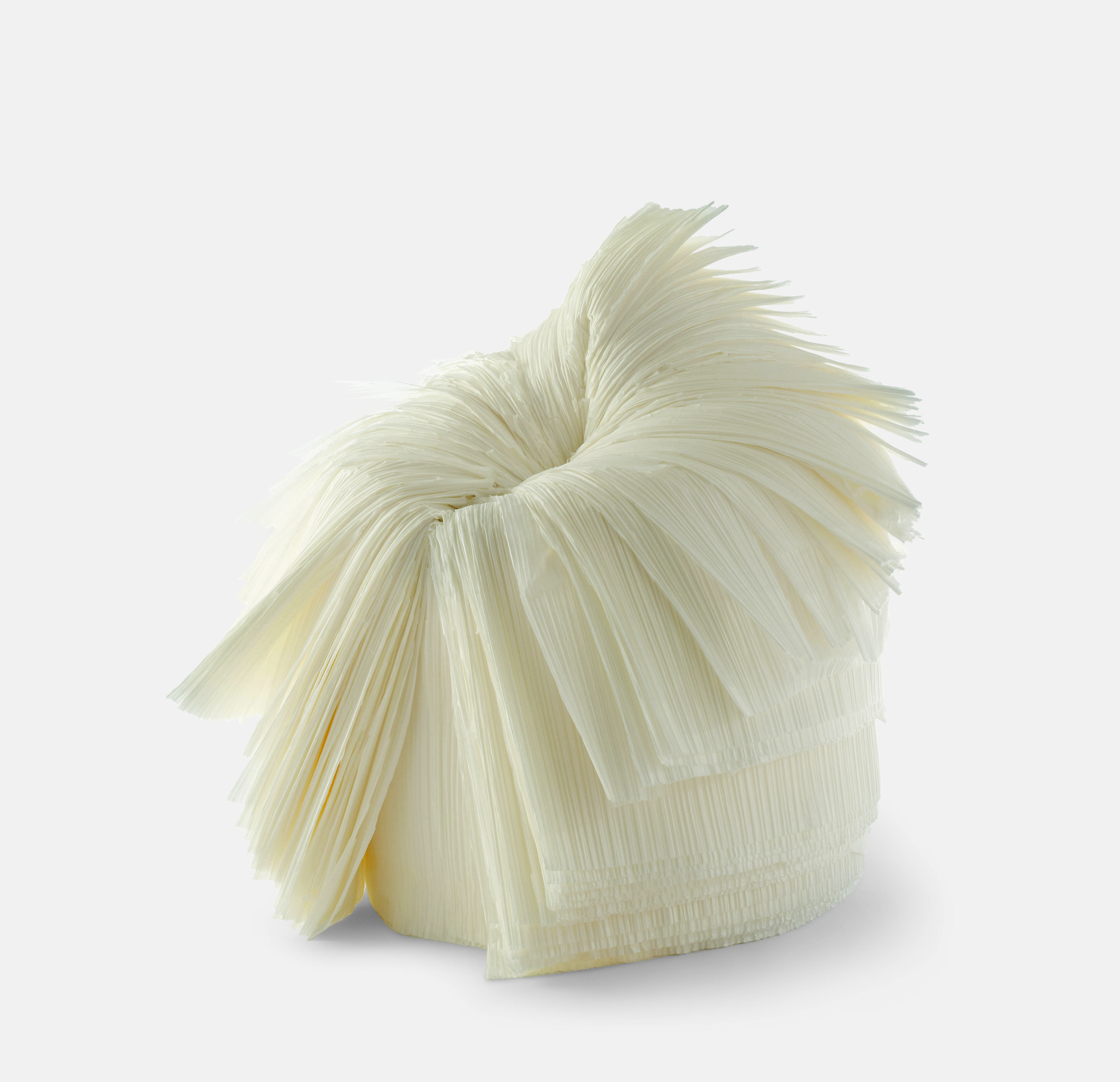
Cabbage Chair, 2008, nendo. Photo: Masayuki Hayashi, courtesy of nendo. Haku (Milky White)
White is just as complicated and highly calibrated. “Like black pure white does not exist as a colour or in the Japanese tradition,” explains the author. “Instead, it is understood as indicating maximum light, as opposed to the absence of light denoted by black. Between these two extremes lies the entire range of greys. One of the most prized whites used in painting is gofun, made from finely ground oyster shells, but there is also enpaku (white lead); nyūhaku (milky white); and kaihakushoku (also haijiro/ash white). Japan’ inherent appreciation for white distinguishes its aesthetic from the West’s; the shade’s importance is marked by notable works of literature such as In’ei raisan (In Praise of Shadows, 1933) by Jun’ichirō Tanizaki and Shiro (White, 2008) by Kenya Hara.”
Iro includes nendo’s 2008 Cabbage Chair (above) as an example of Nyūhaku or Milky White. “Within the range of whites, denoted by shiro or haku, this shade indicates the natural yellowish-white colour of nyū (milk), which is translated in English as milky white,” explains the author. “Historically, however, the consumption of milk in Japan was never as widespread as in Europe, meaning nyūhaku is a relatively new addition to Japan’s traditional colours. It is also one of the few colour names relating to animals.” The diaphanous chair, which was made for a Tokyo design exhibition curated by Issey Miyake (and pays tribute to Miyake’s signature pleats), is the ideal exhibit to express the evanescent qualities the Japanese see in black and white, which so many of us miss.

For more on these shades and much more, order a copy of Iro here.