Premier league crests: a design critique
Design maven Alice Rawsthorn takes a look at British football club crests
The 2012 Games might be over, but the press in Britain and elsewhere have already turned their attention to the football Premier League, as the new season begins this Saturday. English design journalist Alice Rawsthorn writing in The International Herald Tribune, examined the aesthetic qualities of the clubs’ coats of arms.
“Sadly, none of the 20 club crests score highly in terms of design purity of aesthetics” Rawsthorn writes. “Yet most imaginative of them are intriguing examples of vernacular design.” She appreciates the historical qualities worked into some designs, such as the Arsenal’s gun crest, a sign that the original players once worked at the Royal Arsenal in Woolwich, East London; and West Ham’s rivet hammers, which acknowledge the team’s initial involvement with the Thames Ironworks.

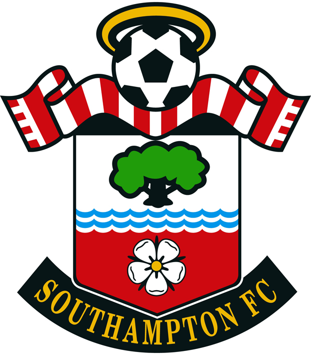
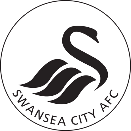
In Rawsthorn’s opinion, Swansea City’s crest is closest to a modernist logo, albeit a fairly prosaic one, with a swan’s wings morphing into ocean waves. Her favourite is Southampton’s badge, which was based on a winning competition entry, and combines water, to signify the city’s docks, a white rose, Southampton’s civic symbol, a halo, for the team’s nickname, the Saints, and a tree, as a nod to the nearby New Forest.