Monopoly for minimalists
US designer Matthew Hollett reduces the classic board game it to “its basic mechanics”
Monopoly has come a long way since it was initially offered by Parker Brothers back in 1934, on a board set around the streets and landmarks of Atlantic City. Latterday variations have introduced Spongebob Squarepants, Thomas the Tank Engine and Luke Skywalker to the property development game.
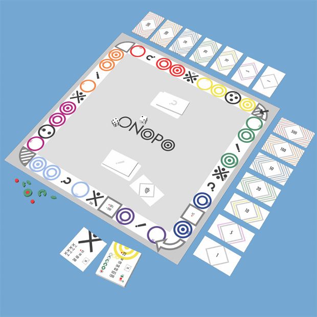
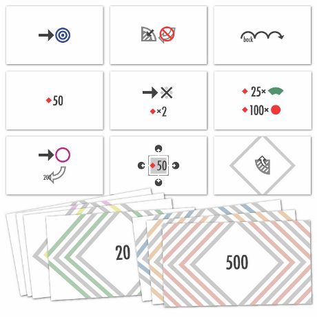
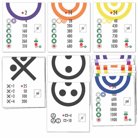
However, one Californian designer has hit upon a novel innovation: the removal of all character and place names completely. Matthew Hollet, set himself the task of “reducing the visual design of the game down to an iconographic system representing its basic mechanics.”
The result, dubbed ONOPO, strips away all geography, and almost all text, to produce a board game that has more in common with Donald Judd or Carl Andre than the ambitions of putative Park Avenue moguls.

In an interview for Fast Company, Hollet explained that his designs were “inspired partly by the visual echo between the three Os in the original game title and the groups of three spaces on the board.”
He also said that while some aspects were easy to reinterpret – nothing happens on the Free Parking square, so he just left it blank – while others, such as the Get Out of Jail card, which can be traded for cash by players, were harder to express symbolically.
Free from city specifics and national currencies, ONOPO could serve as a timely metaphor for late capitalism, shorn of its national boundaries. However, don't go trying to buy one for your Occupy protesting nephew. Hollet asserts that “it’s strictly a personal design project, not a commercial product.”
Instead, perhaps take a look at some other iconic designs in our Archive of Graphic Design.
