Turner Duckworth designs Olympic Coca-Cola cans
The international design company reimagines Coke’s iconic packaging with an Olympic spin
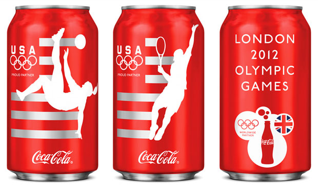
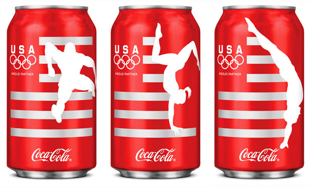
The brand identity and packaging design company Turner Duckworth has teamed up with Coca-Cola’s North American design team to come up with six new designs for Coca-Cola cans to commemorate the Olympics. Available in the US only, each can depicts a different sport with an ‘in-action’ motif of an athlete. The cans will rotate throughout the summer with a new one hitting the market every two weeks. The designs will also feature on bottles and mini-cans.

This is not the first time Turner Duckworth has reworked the distinctive red packaging of Coca-Cola. In 2008 the company’s rebranding of the Coca-Cola range won it a host of awards, including the grand prix at the Cannes advertising festival. Rodney Fitch, head of the design jury and chairman-CEO of design company Fitch said that the streamlined new brand identity represented the "iconization of a brand's heritage".
The London and San Fransisco-based brand identity company also refreshed Diet Coke’s cans last autumn. Diet Coke’s aluminium cans had their text blown up, turned horizontally and cropped so that two cans sat side by side would spell out the drink’s name.

Despite an occasional refresh and seasonal spin, Coca-Cola’s branding remains one of the most recognisable in the world. For more iconic pieces of graphic design, Phaidon’s upcoming Archive of Graphic Design is an unparalleled reference guide compiled by experts for both the design professional and enthusiast. It includes hundreds of images of some of the most famous pieces of graphic design, along with information about their origins and is available for pre-order now.