Palestinian Museum gets branding to prompt talking
Designers Venturethree produce a visual identity for the West Bank museum to promote dialogue in the region
Work starts on The Palestinian Museum in West Bank this month, so now is a good time to take a look at its designs. The building has been drawn-up by the Irish architectural practice Heneghan Peng, which is also behind The Giants Causeway Visitor Centre and the Grand Egyptian Museum beside the pyramids at Giza. The accompanying visual identity, meanwhile, is by Londoners Venturethree, better known for their work on the Sky broadcasting and Penguin books logos.
Heneghan Peng’s design borrows from the terraced hillsides of Birzeit, the town just north of Ramallah, where the new museum will be built; a series of low-level geometric forms step down and push out into the landscape.
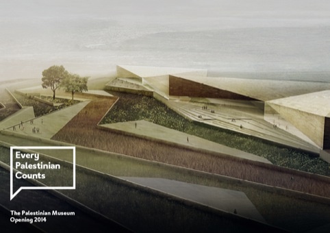
Meanwhile, Venturethree’s identity features the museum’s name in lower case, sitting within a similarly geometric speech bubble. However, the graphic designers were focussed less on the accompanying building and more concerned with the museum’s mission. “The Palestinian Museum is a place where anyone can take part in a shared conversation about the Palestinian present, past, and future,” say the museum’s organisers.
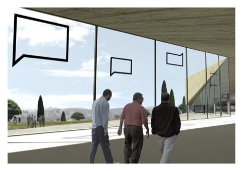
“This is the first time an organisation has had the ambition to think of a museum as a global community, giving the Palestinian people and their culture a voice,” explains Tim Jackson of Venturethree, “We wanted to create a device and symbol that showed that the museum wants to have a conversation.”
Venturethree resisted the temptation to reference the architecture in their graphics. “As this wasn’t a traditional museum project, we avoided basing the identity in the physical form of the museum building,” it explains.
Whatever the inspiration, this design will no doubt work well on all manner of communications, from the website to interiors to a special set of badges emblazoned with inspiring messages like ‘share’, ‘question’, ‘think’, and ‘invite’.
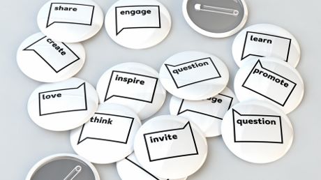
“There will be a wide range of content in the museum,” Venturethree David Milsom says, “so we needed a brand that kept the curatorial voice strong. This device really allows us to do that - it’s bold and confident and whilst allowing the content to express itself.”
And in a nifty graphic move, the bubble is reversed to hold right-to-left Arabic text. “We also had to create a dual language brand, showing the conversation between English and Arabic,” Jackson adds. If all goes to plan, the venue will be opening next year.
Find out more about Venturethree's work on their site, Heneghan Peng’s designs on theirs, and for a greater understanding of visual communications from the invention of the printing press through to the online age, take a look at our Archive of Graphic Design.