American Airlines rebrand upsets Massimo Vignelli
Design legend is not a fan of the new corporate identity that replaces the one he created 45 years ago
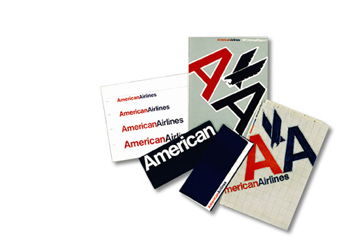
For the first time in nearly four decades American Airlines has changed its image. In design terms, this must have been a difficult decision, as the carrier has been the proud owner of a classic logo created by one of the 20th century’s design greats, Massimo Vignelli.
However, in business terms, perhaps it was an easier decision. The company has had money problems and there are merger discussions with US Airways going on. At the same time, it’s investing heavily in a new fleet and has got some fancy new business-class cabins by James Park Associates in London. So it wanted to show the world – meaning its passengers, prospective passengers, stakeholders et al – that it means business.
The branding agency picked to execute this was Futurebrand, one of those rather faceless international networks of bought and merged studios which have been hoovering up the big projects since the 1990s. But despite lacking the charisma of Vignelli, they have delivered a repositioning which is at least in keeping with the airline’s intentions.

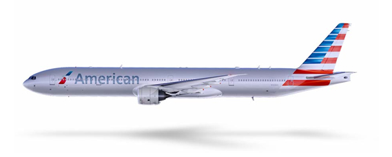
American's name is now written out in a modern-looking custom-made typeface called American Sans. In fact for the aircrafts’ exteriors, the word ‘Airline’ has been dropped completely. This is in keeping with American’s keenness to emphasise its – well - American-ness.
Or as AA’s chief commercial officer Virasb Vahidi puts it: “Our new logo and livery are designed to reflect the passion for progress and the soaring spirit, which is uniquely American.”
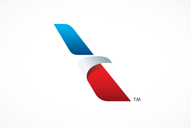
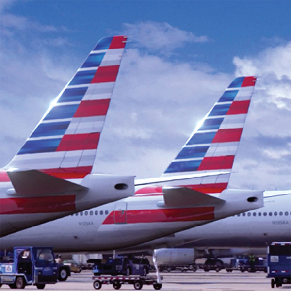
Along with the new typeface are some dynamic graphics on the tail, representing the American flag in stripes of shiny-bright red, white and blue. So far, so good. However, one element of the rebrand which is causing controversy is the so-called flight symbol, which sits alongside the brand name. It’s intended to be a sort of 21st-century amalgamation of many of the elements of Vignelli’s much-loved marque: the eagle, the letter A, the red, white and blue livery, and the star.
Some people may struggle to spot all those references in the two leaning lozenges, but there’s nothing like a bit of post-rationalisation to justify a new logo.

For Futurebrand’s part, the agency believes that the design reflects “a more modern, vibrant and welcoming spirit” for the airline, while “the livery expresses American’s origins but also the spirit of modern America: innovative, progressive and open to the world.”
And like all holistic and integrated logos, this one will get the full roll-out treatment, from websites and mobile apps, to airport terminals and check-ins, lounges, on-board menus and communication material. And like all holistic and integrated logos it's polarised opinion wherever it's been seen - not least from Vignelli himself who sounded off against it to BusinessWeek.com saying:
"There was no need to change. It’s been around for 45 years. Every other airline has changed its logo many times, and every time was worse than the previous one. This is the typical mistake that company presidents make: “I’ll change the logo, and the company will look new.” What you have to have is a president who knows how to run the company, and in that process knows how to evaluate the brand identity. Otherwise it becomes a wolf camouflaged by sheep. It’s still the same company that’s not going to be successful.
"The American flag has 13 stripes, right? Not 11. Did American add only 11 stripes [to the flag on the tail] because they are in Chapter 11? I don’t think two more stripes would have been a disaster. And there are only two colours shown instead of all three. So is it a different flag?

"They’re not going to solve their problems, they’re just going to increase their costs. As you know, one of the great things about American Airlines was that the planes were unpainted. The paint adds so much weight that that brings an incredible amount of fuel consumption. For some reason they decided to paint the plane. The fact is, weight is weight. Design is much more profound. Styling is very much emotional. Good design isn’t—it’s good forever. It’s part of our environment and culture. There’s no need to change it. The logo doesn’t need change. The whole world knows it, and there’s a tremendous equity. It’s incredibly important on brand recognition. I will not be here to make a bet, but this (new logo) won’t last another 25 years."
What do you think? Is Vignelli right or should design change to suit the age? Let us know below and when you've done that check out some truly superlative designs that have stood the ultimate test of time (in some cases, hundreds of years) in The Phaidon Archive of Graphic Design.