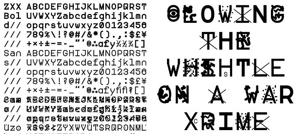
Will this typeface foil the spies?
South Korean designer and former state intelligence worker creates fonts to slow down eavesdropping software
Most typographers prize legibility and clarity of message above all other design consideration. So the South Korean designer Sang Mun is a rarity, as his font is designed to be obscure.
While in national service, Mun gathered intelligence material for America's National Security Agency. Upon discharge, he began developing a font which could interfere with state intelligence gathering. The resultant suite, ZXX, takes its three-letter name for Library of Congress code for a book without linguistic content.
Of course, messages written in one of ZXX's four obscure fonts - Camo, False, Noise and Xed – do contain words and phrases, only they're a little harder to pick out with the naked eye, thanks to dots, swiggles, or the insertion of a larger, false character beside the intended letter.
{media1}
Mun says that his fonts confuse optical character recognition devices which allow institutions such as the NSA to convert texts into digestible data. However, he has no great hope for the fonts to hold out against state spooks indefinitely.
“In all likeliness, it would be impossible to fool the NSA with a typeface for long," he says. “When I first showed the work to my peers, they enjoyed the subtle humour embedded in my political statements. It was obvious that this wasn’t the best tool to fight the authorities, but it did attract attention.”
Think of them, instead, as a nice graphic protest. To find our more, and download the fonts, go here. For greater insight into the uses of graphic art, please consider our Archive of Graphic Design, which features 500 graphic designs, from Gutenberg's press up until the present day.