The story behind the Whitney's new look
New look for New York museum draws inspiration from its chief curator's view of art history
Plenty of us are confounded by the texts produced by contemporary art institutions, yet occasionally these words prove as inspirational as the works they put on show. So it was for Dutch graphic design company, Experimental Jetset when it was tasked with coming up with a new identity for The Whitney Museum in New York. In among the gallery's own publications, the designers found this line, written by the museum's chief curator, Donna De Salvo: "It would be much easier to present the history of art as a simplistic line - but that's not the Whitney".
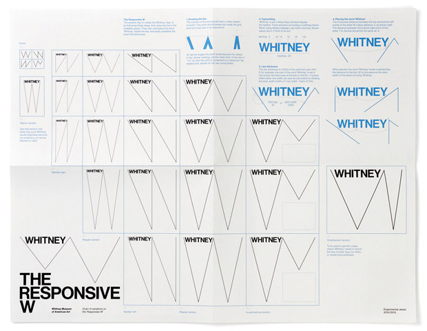
Taking this as a graphical instruction, rather than historical perspective, Experimental Jetset began to toy with the museum's initial, W, regarding it less as a fixed character, and more as a zigzagging expression of contemporary creativity. This resultant, spindly 'responsive w' can slant one way and another, without losing its visual identity, and, the design firm argues, serves to symbolize all manner of creative undertakings:
"The sign of the zig-zag could resemble one of these hidden hobo symbols, graffitied near the train tracks (in this case, the High Line)," a company statement reads. "The shape could also represent the 'dérive'-like journey of the Whitney through Manhattan, moving from one location to the other. It could also symbolize the signature of the artist; or the waves of the nearby Hudson; or the waves produced by sound and vision."
{media1}
It's a neat thought. This responsive 'w' seems to change to suit each occasion, yet remains recognisable in each deployment. Stripped down to a simple arrow, it also looks good on signs and, we imagine, most things in the shop.
{media2}
Experimental Jetset has paired this with a new version of a 20th century Swiss typeface, Neue Haas Grotesk. Christian Schwartz, a young New York designer, redrew this font in 2004, originally at the request of The Guardian newspaper in London. The paper decided against using it, and yet, the firm argues, its new world/old world provenance suits a New York gallery, just as the sharp edges and contrasts look good against the streets of NYC.
{media3}
Visitors will be able to judge for themselves whether Experimental Jetset has reworked this Manhattan institution successfully later this year, when The Whitney takes on its treatment, prior to moving into its new Renzo Piano-designed premises, in 2015. Read more about the new design here. For further insight into graphics old and new, take a look at our Archive of Graphic Design, with features 500 works produced since the 15th century.