Peter Saville destroys Lacoste’s croc
How the graphic designer 'digitally shattered' the French sportswear logo
Peter Saville is still the go-to-guy for a quirky but well-considered identity. Like all graphics gurus, he can turn his hand to anything, from a celebrity rapper – see his recent work with Kanye West – to the entire city of Manchester – Saville served as as a consultant creative director to the city.
This time he’s been set a relatively straightforward task: redesigning an identity for French fashion label Lacoste. The brand turned 80 this year, which is as good a reason as any for a celebratory reworking of its well-known crocodile insignia. However, there’s a twist in the tail, so to speak.
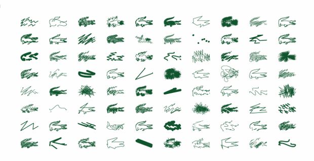
As Saville told the Guardian, “They said: 'Do anything you want, but don't touch the crocodile logo.' So that's what I did: destroyed the crocodile. Digitally shattered it in 80 different ways."
In fact, this latest reinterpretation in the end included a total of 40 different Saville variations, which will adorn the left breast of a white polo shirt in the brand's new range.

Given the open brief, Saville chose to keep the classic green-on-white pairing, while he had his way with the croc. He chose to stick to its existing dimensions, and while some of the marques are orthodox redrawings, others are so abstract as to be humorously unrecognizable. A couple of thick straight lines, a mad scribble, six join-the-dots, or an artistic blob. However obscure, for Lacoste die-hards they will all have an instant familiarity, and may even become collectors’ items.
See more of them here. For a greater understanding of well-known fashion brands, take a look out our peerless overview, The Anatomy of Fashion. For more on graphic heritage and innovation, including some of Saville's other designs, pick up a copy of our Graphic Design Archive. Buy them both from the people who made them, here.