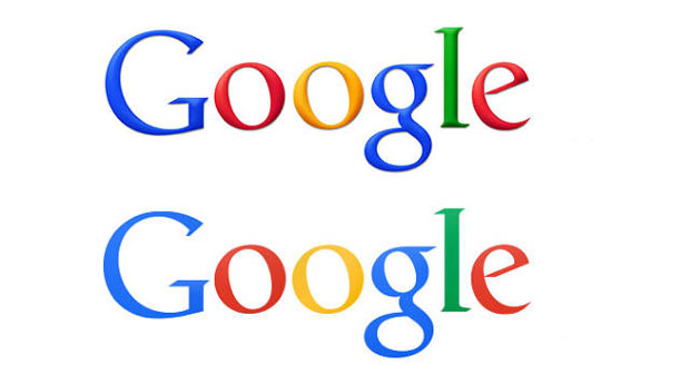
Is this the new Google logo?
The Google logo seems to have grown up (and been toned down) in the Chrome Beta for Android APK
While we’ve all been waiting with baited breath for Yahoo to commit to a single new logo, after its month-long daily redesign, another internet giant has been at it behind our backs.
Google has taken the more conventional route of keeping its head down until it was ready to commit. But as some corporates over the years have discovered to their chagrin, yet-to-be-revealed marques can sneak out. So it was that Google’s new identity got an early airing, seemingly displayed by accident on the Chrome Beta for Android APK.
And as there’s no official word from the tech business itself, so we're left speculating as to whether this will receive a bells-and-whistles launch, or whether it will be drip-fed onto a limited number of and services.
In the meantime, the world can take a moment to enjoy this undoubtedly improved version. For such a big, grown-up company, Google’s toybox identity had long seemed rather inappropriate. It wasn’t just the jaunty angle of some of the characters, but the primary colours and all that photoshop shading.
While the new letters don’t appear to have been redrawn, they’ve lost their shadow effect, and have adopted some more muted tones. It’s one of those clever changes which will leave some consumers none the wiser, and will keep those who notice decidedly on-side.
If, like us, you're a big fan of typography and logos we have some books you might like to go further with. First off there's the Phaidon Archive of Graphic Design at its new, competitive price point, or Marks of Excellence if logos are your thing and do not forget Michael Johnson's superb Problem Solved which explains how to produce innovative work, avoid repetition, stand out in the market place, reinvent a tired brand and use shock tactics.