The FT’s new font is on the money
New Zealand’s Klim Type Foundry overcomes traditional newsprint typography problems with new font Financier
Though it's a fast disappearing problem "Newsprint is apparently "a brutish environment for typefaces," according to Kris Sowersby, the founder of Klim Type Foundry in Wellington, New Zealand. "Outlines get distorted; small gaps get filled in; and black ink turns grey and bleeds all over the shop," Sowersby adds.
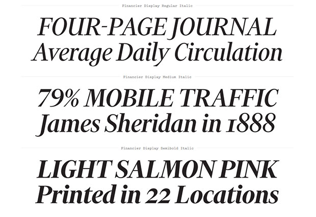
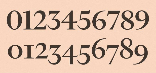
Klim were commissioned by The Financial Times' head of design, Kevin Wilson to come up with a new look typeface for the UK's financial daily of record. The result is called Financier and it's an elegant, authoritative typeface versatile enough to handle news and features, while at the same emote the newspaper's very British heritage.
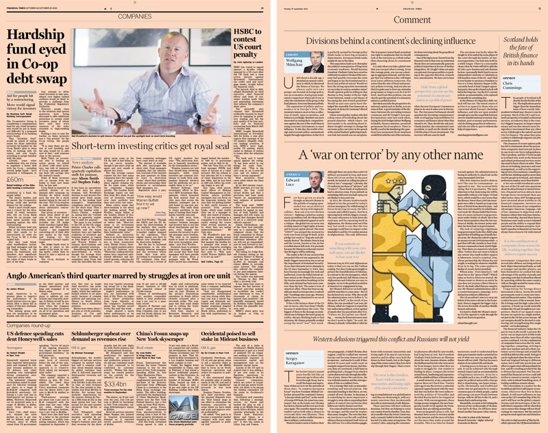
The new look is now being rolled out to the paper's web and app. The simple redesign, which manages to accommodate the needs of those two different beasts: print and digital, has been about as well-received as Kevin Wilson could have hoped.

"The newspaper wasn't broken," Wilson points out, "but we needed to update and modernise it - to show an ongoing commitment to print while refocusing our editorial priorities. The design also needed to deliver a run of pages and graphic formats that were more standardised - to make forward-planning and web-to-print translation easier."
Sowersby went back to the famous British designer Eric Gill's work, in particular his Solus, Joanna and Perpetua fonts from the 1920s and 1930s. At the heart of the redesign is the rethinking of fonts, grids and graphics. The grid has gone from eight columns to six, the pictures are bigger and better-considered, and the FT has a new typographic palette.

To find out about another Phaidon's ongoing relationship with the FT, watch Ferran Adrià at the FT dinner in New York, here. Meanwhile, for more on graphic design from the Gutenberg Press up until today, grab a copy of our book in a box, The Phaidon Archive of Graphic Design.