Neville Brody and Jonathan Glazer brand Channel 4
'Never mind the numerals' was the brief to the two creatives asked to 'get to the heart of the channel'
The British TV station Channel 4 first began broadcasting on 2 November 1982, and came of age in a time when the prefix 'designer-' was applied to everything from sunglasses to soap. Its bright, Sottsass-style puzzle logo, designed by the UK agency Lambie-Nairn, certainly captured the times, and remains in use today.
But TV broadcasting has become a lot more competitive in the intervening decades so the channel recently commissioned two British heavyweights to update its brand. This week it unveiled their work.
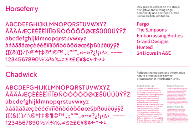
The channel's new typefaces are by the brilliant graphic designer Neville Brody – better known for his work on the Guardian and Times newspapers – and take their names, Horseferry and Chadwick, from the names of the two roads that run beside the broadcaster’s London headquarters.

Chadwick, the more conventional of the two, which will be used to convey simple information, is, according to Brody, “based on the idea of updating British modernism - the dependable language of our motorways, railways and information systems”; the odder-looking Horseferry font, meanwhile, which will be used for headlines, celebrates, “the idea of our nation as one of inventors, eccentrics and individuals.”
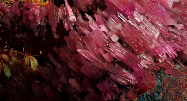
These new characters will be accompanied by a series of deconstructed versions of the Lambie Nain, puzzle logo, created by the channel’s in-house agency, 4Creative, which arranges the nine, angular, constituent parts of the symbol into a jumble of crystal-like forms.
Finally, the film director Jonathan Glazer has shot a series of spooky, tropical-looking idents around the theme of this crystalline new logo.
How does this diffuse exercise help the TV station? Well, Channel 4 says, “We didn’t want to tell people what channel they’re watching. We wanted to tell them why they’re watching it in the first place.”
By moving beyond a simple number – which, let’s face it, does feel a bit 20th century – Channel 4 does seem to have captured some of the stylish, unconventional and entertaining qualities that lie at the broadcaster’s heart.

Meanwhile, for greater insight into graphic design, from the advent of the Gutenberg press up until the present day, order a copy of The Archive of Graphic Design, here.