
More from the book that inspired Mad Men's credits
Greg Quinton describes how he updated our inspirational design primer, A Smile in the Mind
Where do great ideas come from? Often they're bounced off of other good ones. Take the Emmy-winning US director and designer Steven Fuller. After receiving his brief for the Mad Men opening credits from the show’s creator Matthew Weiner (which basically consisted of: 'I imagine a guy walking into a building, taking the elevator up to his office, putting his briefcase down and jumping out the window...but not that!') he turned to a copy of our inspirational 1996 graphics compendium, A Smile in the Mind and happened upon an obscure 1985 desk calendar designed by the Roundel Design Group. The image triggered a sequence of creative events in his mind that culminated in Mad Men's now iconic tumbling silhouette opening sequence.
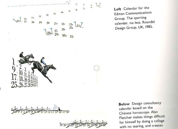
Now, 20 years after its original issue, Phaidon has updated A Smile in the Mind, adding in hundreds of new examples of witty image play, so that many more creatives - for decades to come - wil be, we hope, similarly inspired. To celebrate the publication of this new edition this week we caught up with co-author Greg Quinton, Executive Creative Director at the branding and design firm The Partners. Greg was featured in the first book and helped create the all singing, all dancing, new one, alongside fellow author Nick Asbury of Asbury & Asbury. Read on to find out why he thinks, two decades on, wit and good design are still so effective.
{media2}
Why has this book been so incredibly successful? The structure! There are lots of design books that feature this or that agency or person, but this one actually deconstructs how ideas work. There are some truly illuminating interviews with some of the world's top practitioners. Anyone can flick through A Smile in the Mind and feel inspired. Books are so well suited to that process. You can pick them up, mark the pages you like. There’s an extra level of satisfaction with books.
The new version obviously includes a lot of digital work. Is the humour in the new examples similar to the older print, and product inclusions? Yes. We wanted to cover the wittiest work from the past 20 years, so the amount of digital work in there is huge. But I think that simple manner of engagement remains the same. Consider the song Dumb Ways to Die, an Australian rail-safety public service announcement. That’s a difficult subject, yet it’s a brilliantly engaging piece of work that turns something negative into something positive. You get the message, but it’s charming, the song stays with you. It’s had over 122,000,000 views on Youtube, and has been reproduced in other countries. There’s a tough message that uses humour brilliantly.
There are over 300 designers represented in this book. What marks out the great ones? The ability to break communication down so that someone else will receive it in the right order; knowing what order bits of information will be taken in and understood. You might only be playing with a bit of text and an image, but if you don’t get them in the right order and balance you then it doesn’t work.
What qualities are brands keen to emphasise today? After the 2008 financial crisis, there’s been huge emphasis placed on honesty and integrity. It’s been interesting to watch how McDonalds is trying to appear make some of its restaurants look like corner delis. Do people believe it? No, but in time they’ll soften. It’s like when you travel on the tube and you hear the announcement, ‘London Underground has a good service on all lines’. In time you’ll begin to believe it!
Is witty work the most effective work? Not necessarily. Sometimes you get the joke, and forget the brand. However, I think laughter is, as the comedian and pianist Victor Borge put it, is the shortest distance between two people. If you can engage with people humorously, you create a bond. I also think witty design makes the world a nicer place. We see 5,000 images per day, and probably 4,900 of them are pretty bad. I’d rather engage with someone, rather than insult intelligence. After all, we all like a laugh.
What’s your least favourite piece of branding from the past few years? Few years? I could pick out my least favourite piece from the past few days. I have written in the past about the London 2012 Olympics logo. I still think it’s bad. The experience of being in London during the games was so overwhelmingly positive that the logo is now loaded with that positivity. Yet, fundamentally, I think the logo was always challenging. I struggled to make a connection between it and the spirit of London. I’m not looking for some cliché or stereotype, yet there are fashion designers who can capture the city’s spirit in a single garment. That aside there’s always new work that makes me squirm, not because it is especially bad, but because it's a missed opportunity. Take Ebay or Microsoft - work like that depresses me a little.
Tech firms initially were proud of their poor graphics, as if they demonstrated that they succeeded without slick design, rather than because of it. Yet a few well-known online brands make it into this new edition. In Google’s case, it was less the logo and more the Google doodles. Some of those are very good. We all know Google and its parent company, Alphabet, is one of the largest firms in the world. Yet the doodles make you engage with the brand on a personal level. They’re charming. You want to invite them into your life. I think if Google lost the doodles, we would start seeing them as more of a corporate entity.

We think of successful creatives as being varied in their output but a few of the succesful ones in the book - Alan Fletcher, Noma Barr, for instance - almost have a signature style. Yes. It’s interesting to look at those two, because both took, or take a very hands-on approach. When it’s just one or two people producing the work, there’s a consistency of thinking and execution, which you don't see in larger agency.
Can you fix a gone bad brand with humour? It’s tricky. You certainly don’t brush it over. You’ll be found out. The best thing to do is to be honest. Use the empathetic part of humour to help you with that messaging. And don’t underestimate the public’s intelligence.

How about when a brand has simply gone off the boil? Difficult again. It’s hard to slap some fun onto a company. A few years ago Coke went very slick, adding drip designs onto its cans. I don’t think that worked. It very much looked like a commodity. What everyone loves about Coke is the way it connects back to Christmas, to positivity and to childhood. It evokes a memory, like in the film Ratatouille, when the rats cook for the stuck-up food critic. They may only prepare a dish of ratatouille, but the critic wells up because this pile of vegetables has transported him back to his childhood. You don’t have to offer people that much, but you do have to engage with them.
To see more of what Greg is talking about order a copy of A Smile in the Mind here.