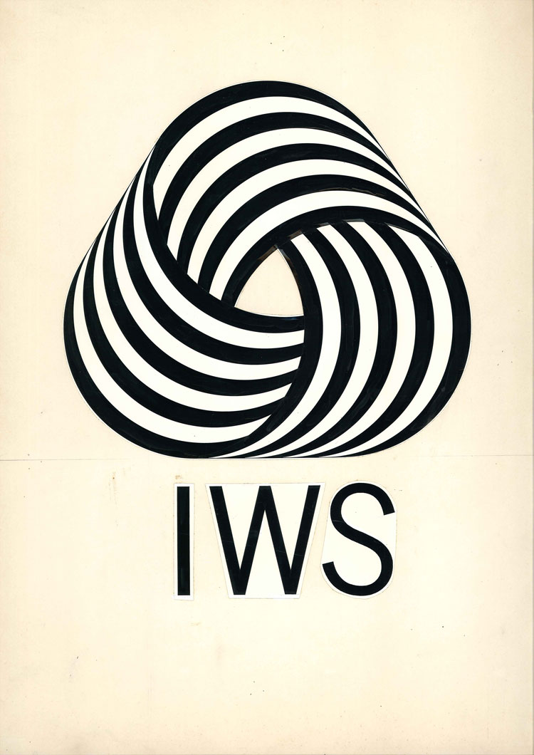
Did you know the Woolmark was made by an Italian Futurist?
A new exhibition traces the progression of Franco Grignani from the avant-garde to slick commercial design
In 1963, the International Wool Secretariat launched a competition to design a symbol that would signify “wool’s inherent quality and superiority.” The winning entry came from an unknown Italian entrant, named Franceso Saroglia.
Who was this obscure designer, who created so striking and effective an image? He was actually a fairly well known Italian artist and architect, called Franco Grignani, who had entered the competition pseudonymously. Why? Well, Grigani was also on the competition’s jury. It’s unclear whether he passed on early drafts of his monochrome, geometric design to a real Milanese advertising executive called Saroglia, who entered it into the competition before Grignani appointed to the jury; or whether Grignani wilfully mislead his fellow jurors, by slipping in his entry once he was on the panel.

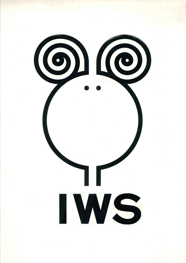
In any case, the design remains Grignani best-known, though not his only work. A new exhibition, Franco Grignani: Art as Design 1950-1990, draws together a wide range of Grignani’s 20th century abstract, geometric work, some of which appears to prefigure 1960s Op Art and some of which traces Grignani career, as he veered from the 1930s cadres of the avant-garde to the groovy design studios of mid-century Milan.
“Like many experimental Italian painters, Grignani was briefly affiliated with the Futurist movement,” explains the Estorick Collection, which is hosting the show. “In 1933 he participated in the huge Great National Futurist Exhibition in Rome; however, most of his works from this period are now lost. After 1935 his work turned toward geometric abstraction, abandoning any lingering figurative elements.
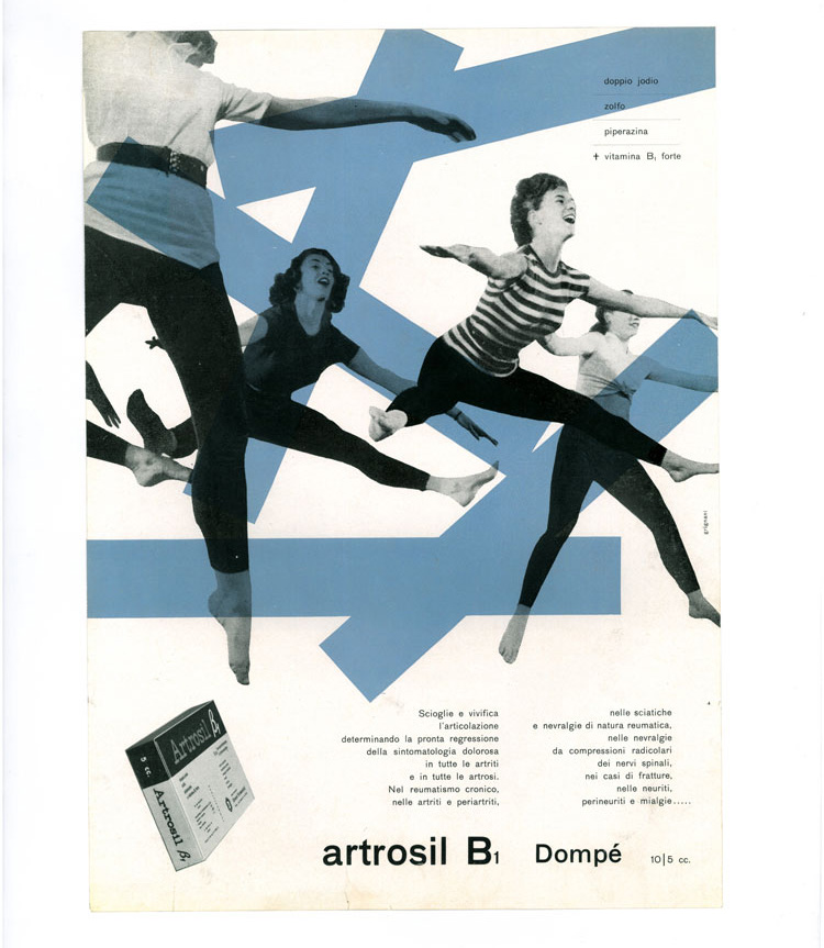
“Grignani studied both mathematics and architecture between the late 1920s and the early 1930s, before opening a studio in Milan that specialized in exhibition design and graphics. Over the years he produced advertising campaigns for a variety of high-profile companies, including Pirelli and Alfieri & Lacroix, and designed covers for a number of science fiction novels published by Penguin Books in the late 1960s.”

Grignani died in 1999, and so could not take in the praise his work received in 2011, when the British magazine Creative Review voted the Woolmark the best logo of all time. At least London art lovers will be able to trace the (black-and-white) lines that connect this well-loved commercial motif to earlier artistic movements.
For more on Woolmark get Graphic; for more on Futurism get Art in Time.