Happy birthday Helvetica!
Javier Mariscal, Pep Carrió and friends mark the typeface's 60th with some specially commissioned posters
There can’t be many typefaces that have had documentary films made about them. But Gary Hustwit gave Helvetica that honour in 2007, to mark its half-century.
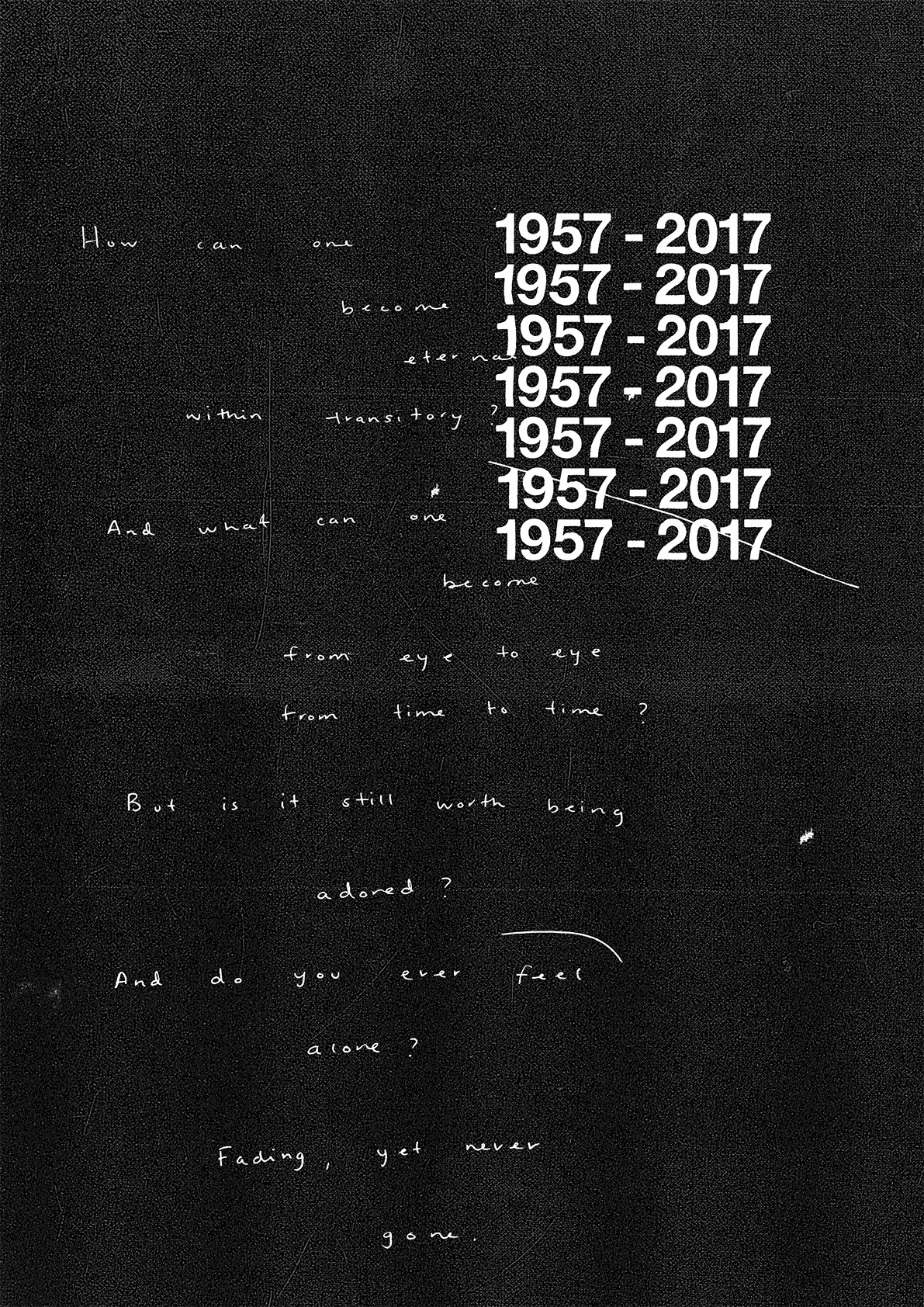
A decade on, its 60th anniversary is being celebrated more modestly but no less stylishly - with a set of specially commissioned posters. Spanish studio Husmee – which turns 10 this year – has released 19 posters by some of the great graphic designers.

Build, Graphical House, Hey Studio, Spin and Toko, Javier Mariscal and Patrick Thomas, among others, took on the task of trumpeting the delights of the ubiquitous sans-serif, designed in 1957 by Max Miedinger and Eduard Hoffmann.
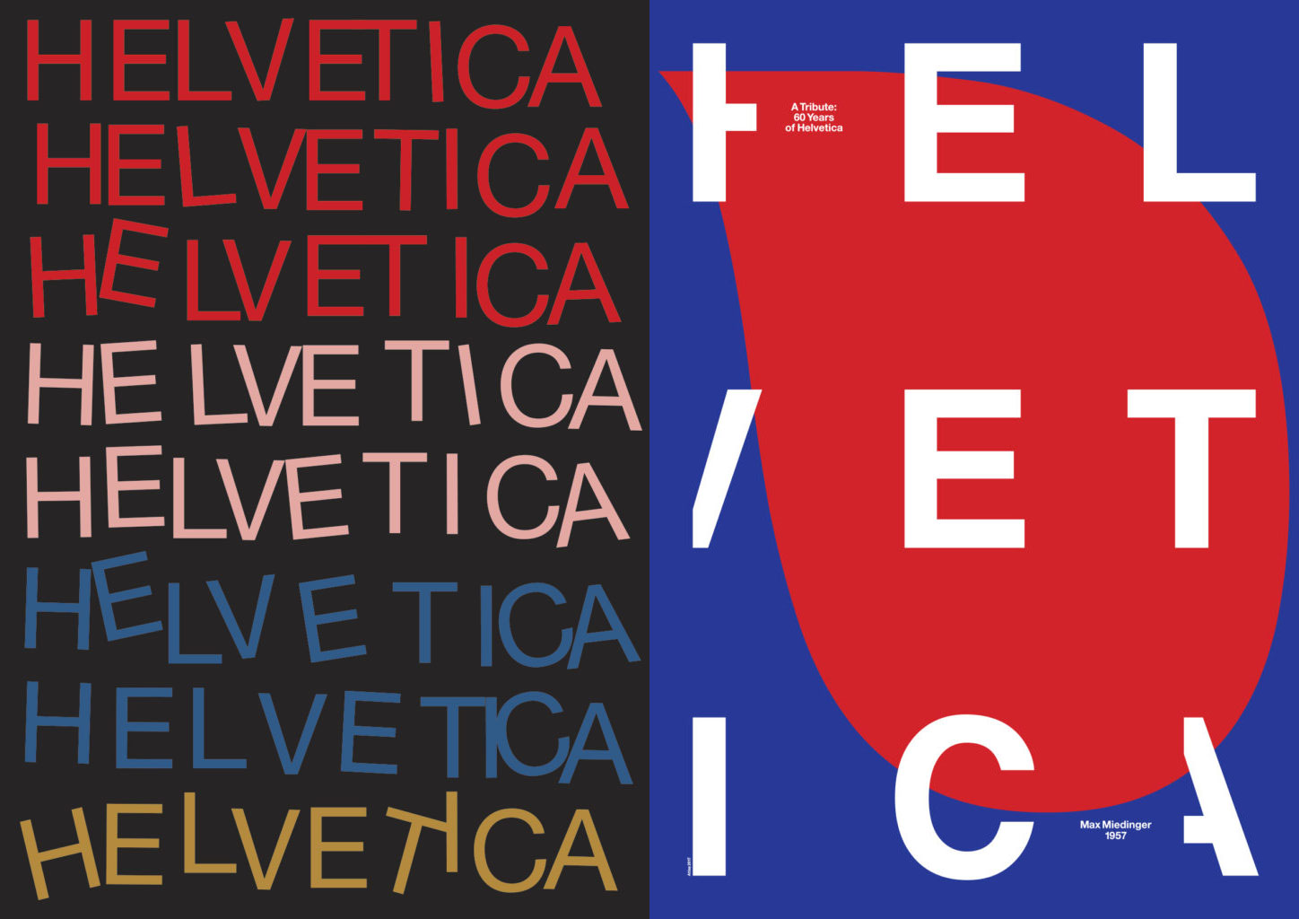
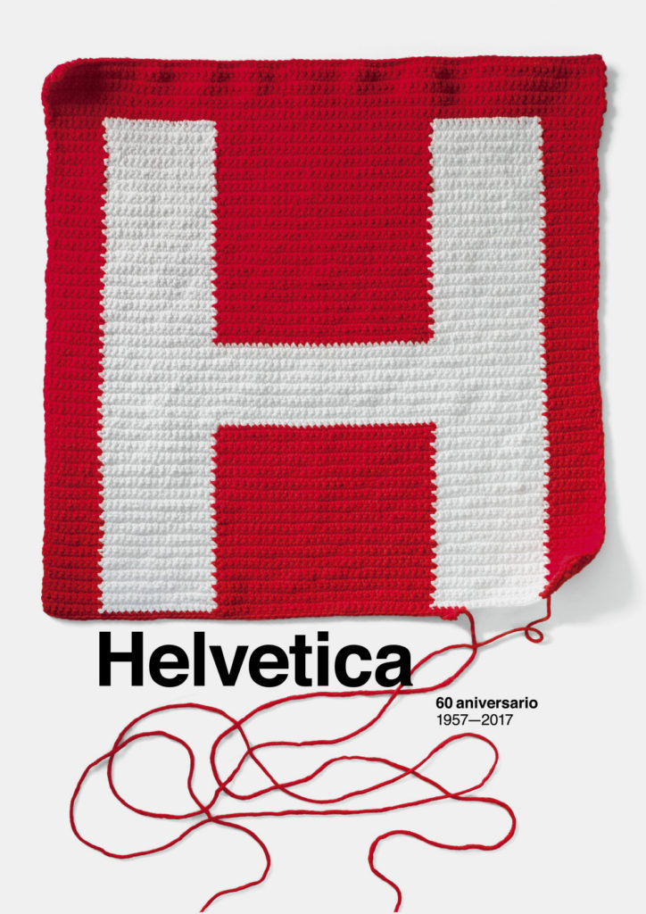
“They had total freedom for developing their works,” say Husmee, “the aim of the project was that the outcome showed a diverse group of designs.” Some are pretty straightforward, like Atlas’s rewriting of the word Helvetica on a blue and red background, or Pep Carrió’s ‘knitting’ of a big uppercase H, taking it back to its Swiss routes with their colour choices. Others are more complex, like Grapheine’s busy collage effect around a white cross.

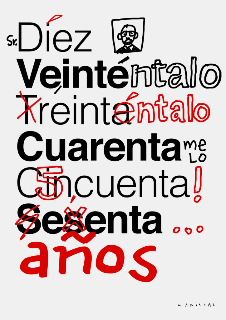
BVD have done some vertical wordplay, juxtaposing Heaven and Helvetica. And Mariscal has fulfilled expectations with a cartoon-style graffiti rendition.
For all its Swiss neutrality and clean-cut beauty, Helvetica’s very omnipresence has devalued it for some people. But despite adding to its output through their endeavour, Husmee hopes the posters will “acclaim, criticise, adore and open a debate about this typeface”.

Husmee certainly enjoy the medium of the poster. At Barcelona Design Week two years ago, the firm displayed 53 such works by top-notch designers including Milton Glaser, Build, Graphical House, Javier Mariscal and Magpie, to mark the first anniversary of the death of Italian designer Massimo Vignelli.
For more great works of graphic design take a look at our book Graphic.