It was 20 years ago today. . .
... Rihanna told the DJ to play. To celebrate the anniversary of her first single release, 20 years ago, take another look at our Rihanna book through the eyes of its designers, Jonathan Barnbrook and Marwan Kaabour.
Twenty years ago this week, Rihanna released her first-ever single. The song was one of three on a demo tape she'd been asked to record in New York after being discovered in her native Barbados by record producer Evan Rogers.
The rest of the story quickly became history. Pon de Replay – from her debut album Music of the Sun – peaked at number two on the Billboard Hot 100 in the US and reached the top ten in charts across Europe. Not a bad start for someone who has gone on to dominate the worlds of music, fashion, and pop culture in the years since.
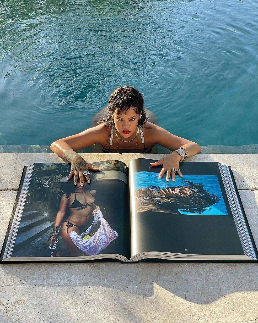
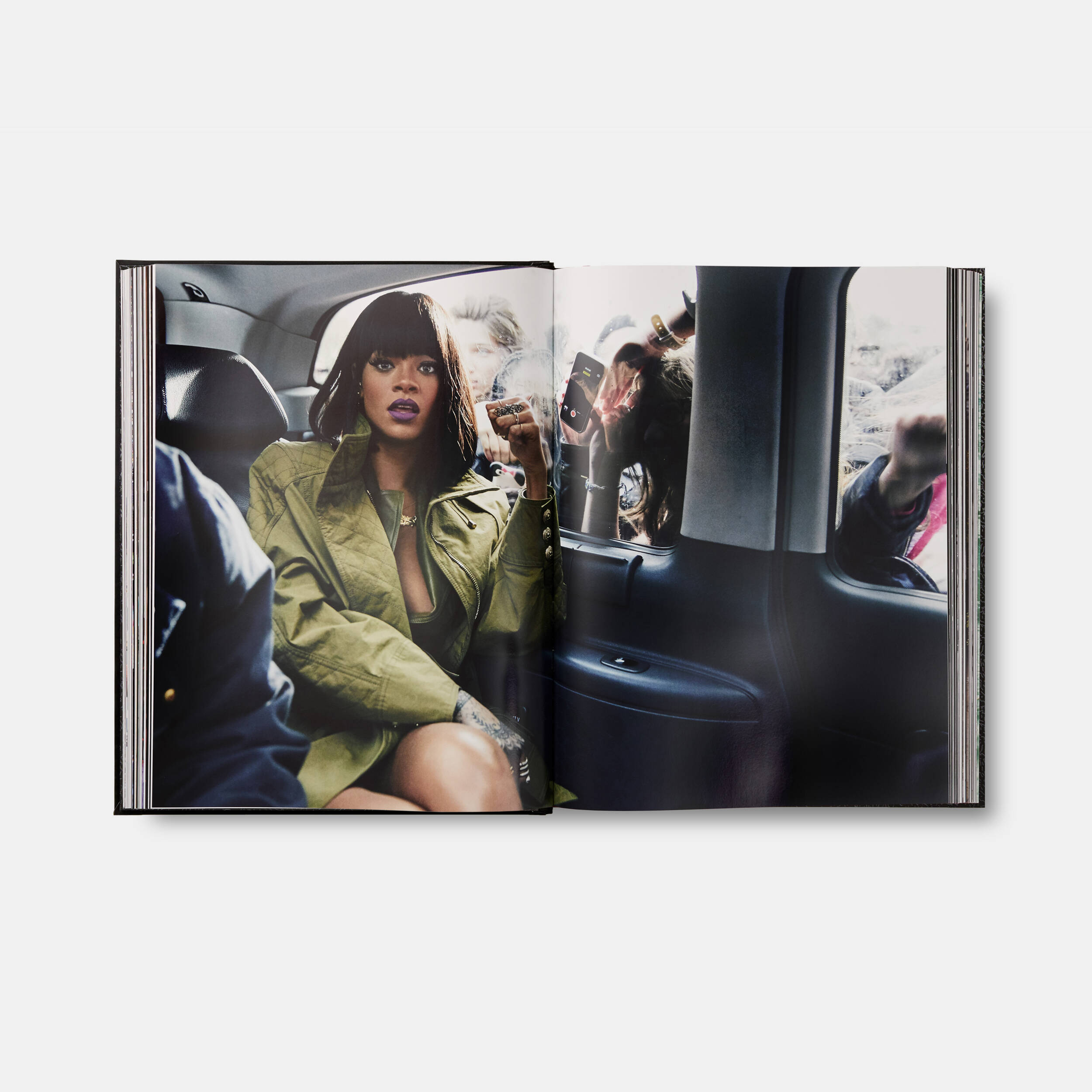
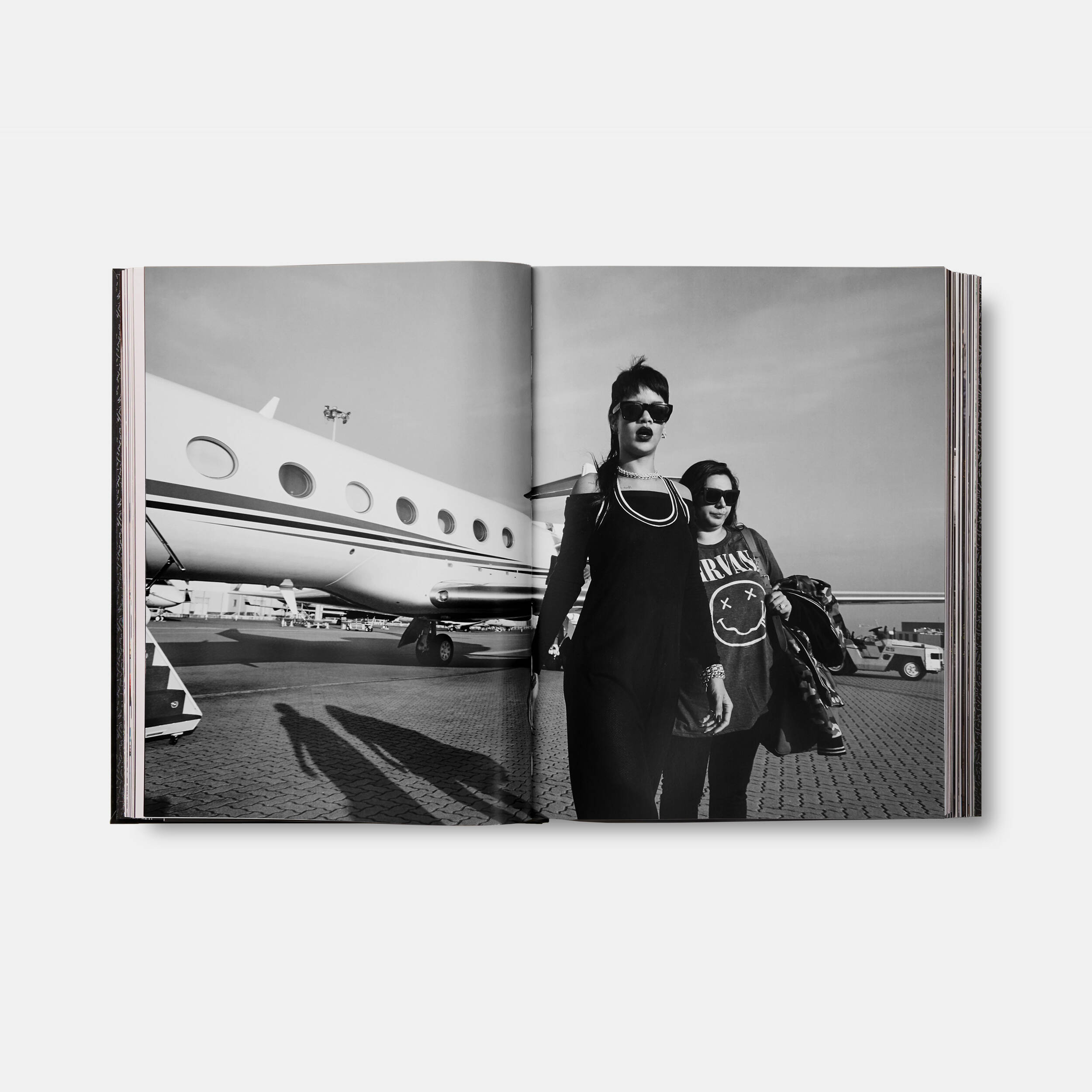
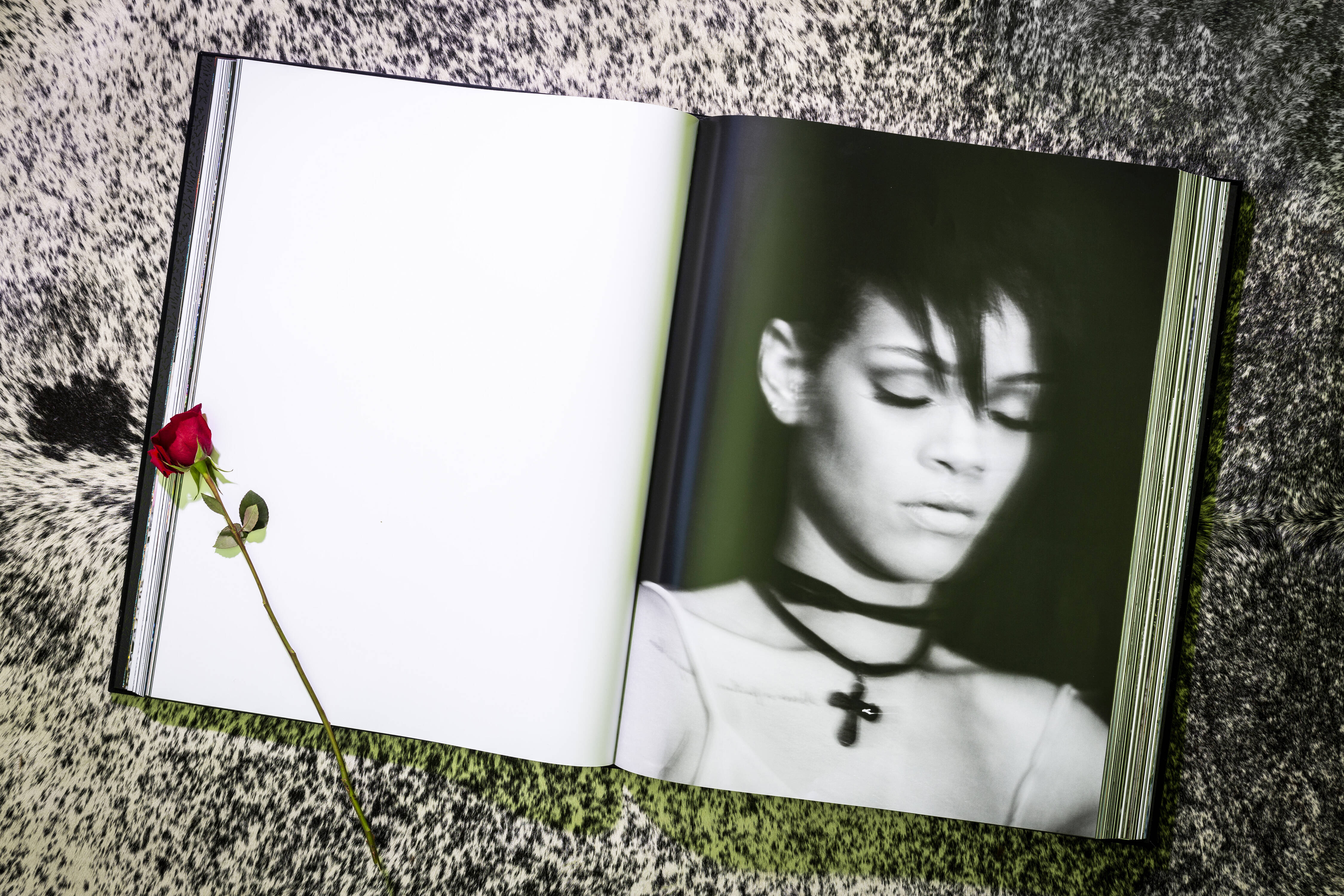
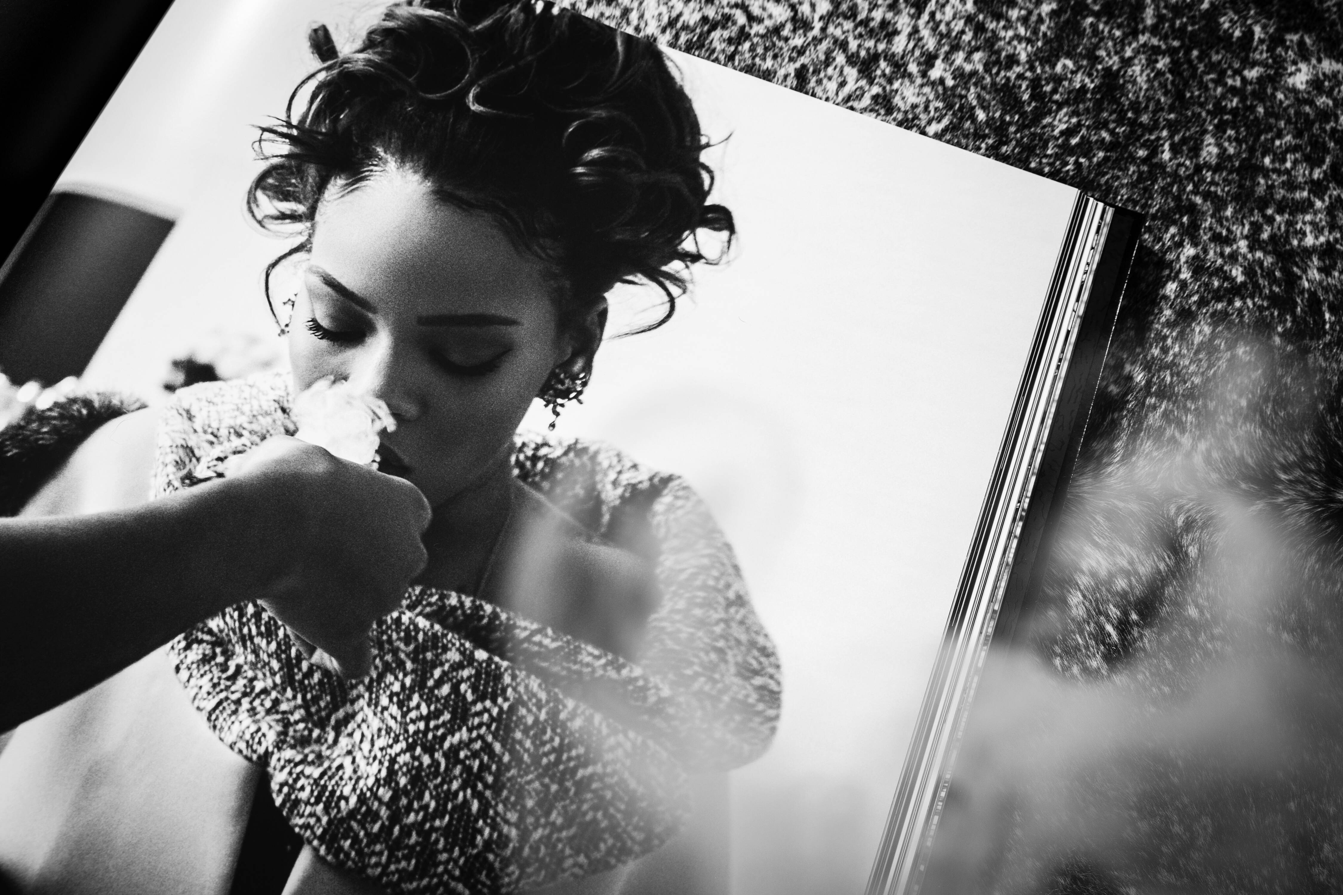
In 2019, we collaborated with Rihanna on her debut book: a stunning visual autobiography revealing, via intimate photographs, the star’s life as an artist, performer, designer, and entrepreneur.
Impeccably produced, this sumptuous large-format book features 1,050 images, 7 gatefolds, and 11 special inserts, including 9 bound-in booklets, a die-cut tip-in sheet, and a double-sided removable poster. The endpapers, designed by Los Angeles-based artists the Haas Brothers, feature a custom design in spot gloss on a rich, black paper stock.
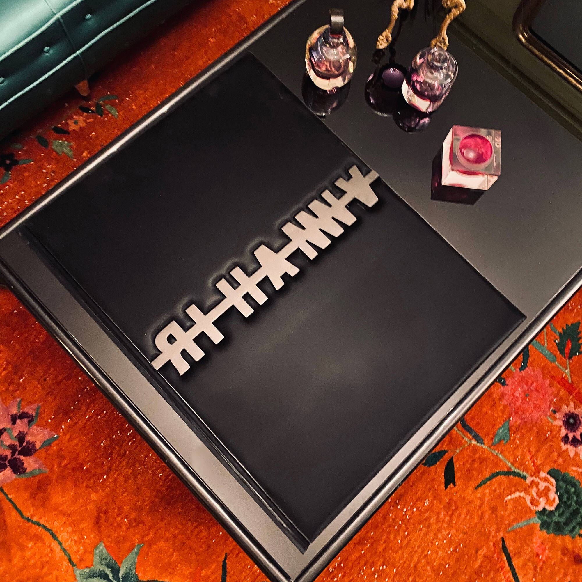
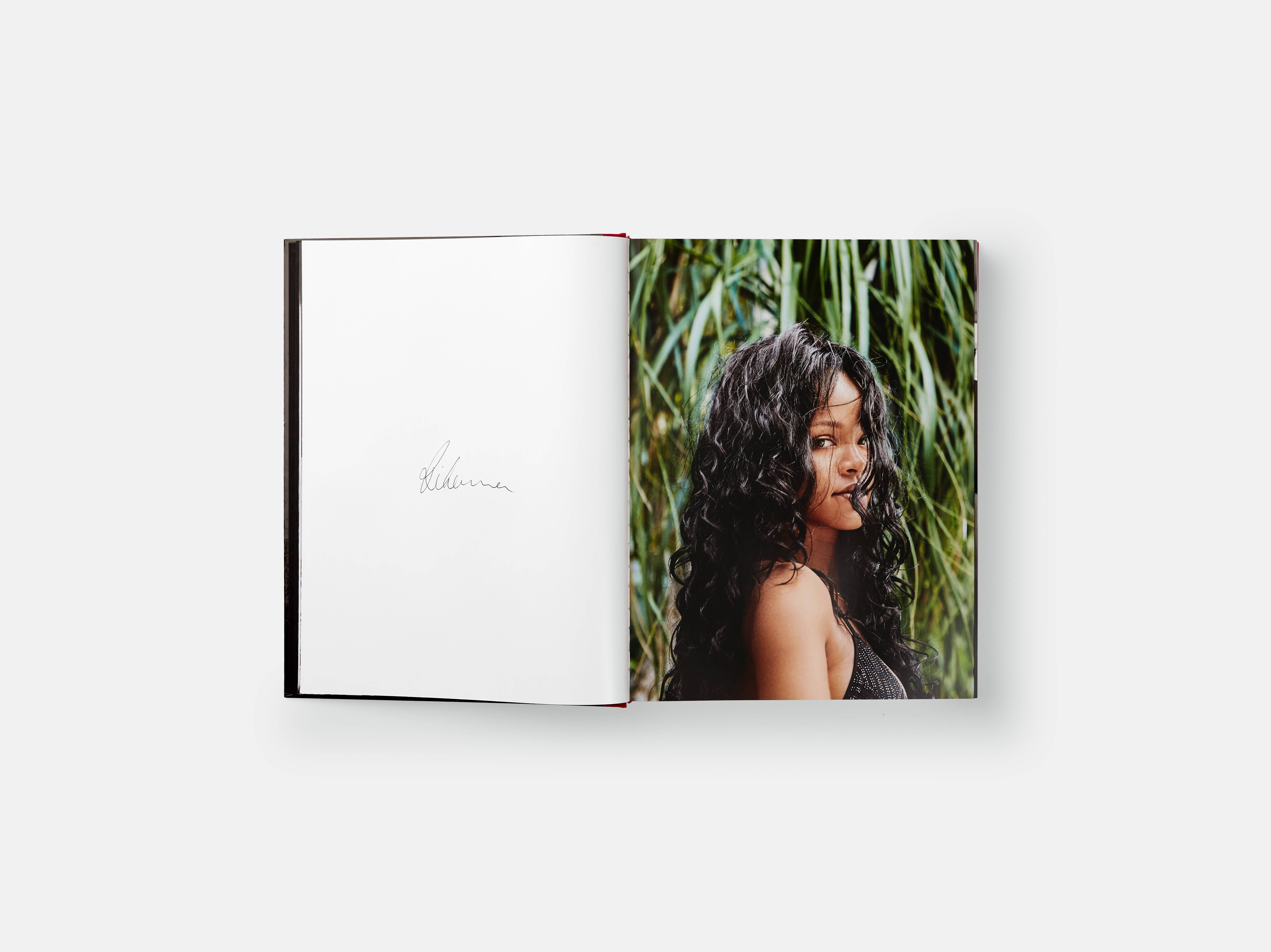
The book comes in a couple of special editions: Love, Rihanna: Luxury Supreme is a large-format edition, limited to just 500 copies, bound in a bespoke Japanese-designed fabric with a pearlescent finish and featuring a matte black, laser-cut steel logo imbedded into the front cover. Each book has been signed “Love, Rihanna” by Rihanna herself.
There’s also the Luxury Supreme edition, signed by both Rihanna and The Haas Brothers. The book is cradled by an extraordinary Haas Brothers sculpture, “Drippy + The Brain,” a custom cast-resin tabletop bookstand plated in an 18-carat gold colour with mirror-finish. Rihanna herself called it “a piece of art that I am really proud of.”
To celebrate the 20th anniversary release of Rihanna’s first-ever single, we thought you'd like to read our interview with the designers of the book, Marwan Kaabour and Jonathan Barnbrook, with supporting notes from The Haas Brothers, originally conducted on the eve of the book’s release. Rihanna’s life might be lived on private jets, stadia stages, and the front rows of Fashion Weeks around the world, but the book itself was designed and laid out in the unassuming London studios of Barnbrook, one of the world’s leading independent creative design studios.
It was there that senior designer at the time, Marwan Kaabour (who’s since founded his own interdisciplinary practice) had the enviable task of turning these candid images into a compelling, revelatory narrative. In our interview, Marwan and studio founder Jonathan Barnbrook explain why they wanted to show the global superstar’s more vulnerable moments - as well as the starry ones.
Even before the studio embarked on the Rihanna project, Barnbrook’s contribution to design had already been officially recognised with a retrospective at the Design Museum in London in 2007 and a Grammy Award in 2016 for David Bowie’s Blackstar album cover artwork.
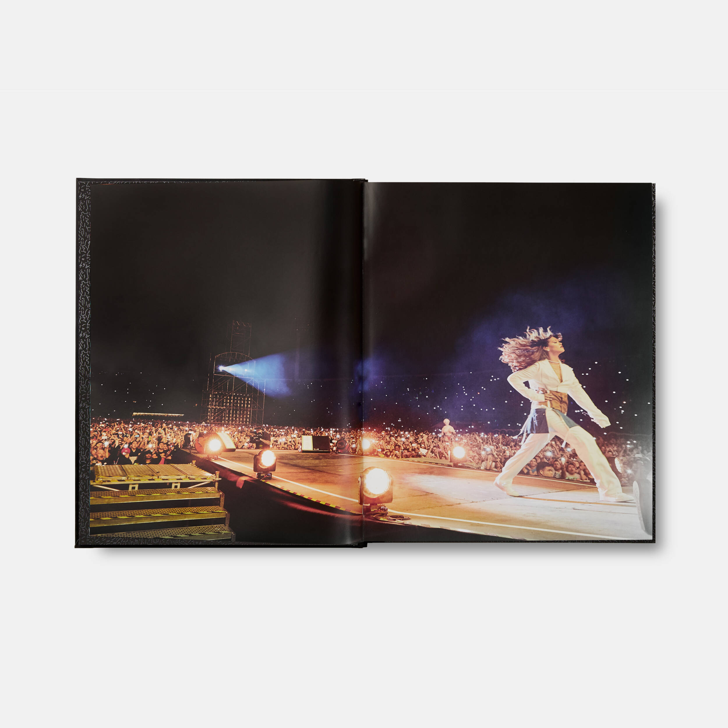
“If you look at the book, you will see that her beginnings were anything but glitz and glamour,” says Marwan. “Looking at it, you really do recognise and appreciate the amount of hard work she has put in, from very early on. To see where she has arrived really is astonishing.” The energy of the Rihanna book is high throughout, but particularly so in the opening pages which drop the viewer headlong into Rihanna world. “The pacing of the book was dictated by Rihanna’s life,” Barnbrook says. “She is right in the middle of this crazy universe, and she is this incredible energy attractor, so the book and the design had to reflect where she is at.”
“We were definitely not interested in a cold, clean, quiet book where there’s one image per page,” Marwan adds. “We wanted to signify the insanity of the universe she occupies. We did toy with the idea of having chapter openers and having the book in sections, but I think Rihanna was more excited about the idea of having something that flowed from beginning to end, without stopping. And the text comes in at certain points to annotate the story. So, it doesn’t work like an ordinary book. It enters when it needs to say something, or to be a comment, or a note or a caption, or even a location locator.”
Jonathan: “But, then again, there is a micro and a macro way of navigating the book. You can just casually flick through it, but you can also sit and inspect every image. So, it’s also about the viewer and the speed they choose to go through the book.”
It’s a visual autobiography, not a conventional autobiography – how did that affect your design approach? Marwan: “Good question! You can tell a story in a variety of ways. And the sheer scale of this book, and the number of images, allowed us to tell a very detailed, and very intimate story. The words are there to kind of tap into one memory, or one location or one event. And, in addition to that, there are all these inserts that provide an anecdote here and there, so there is a lot to go through. So yes, you can admire it for lovely images, but if you choose to engage with it as a sort of narrative there is also a lovely story there.”
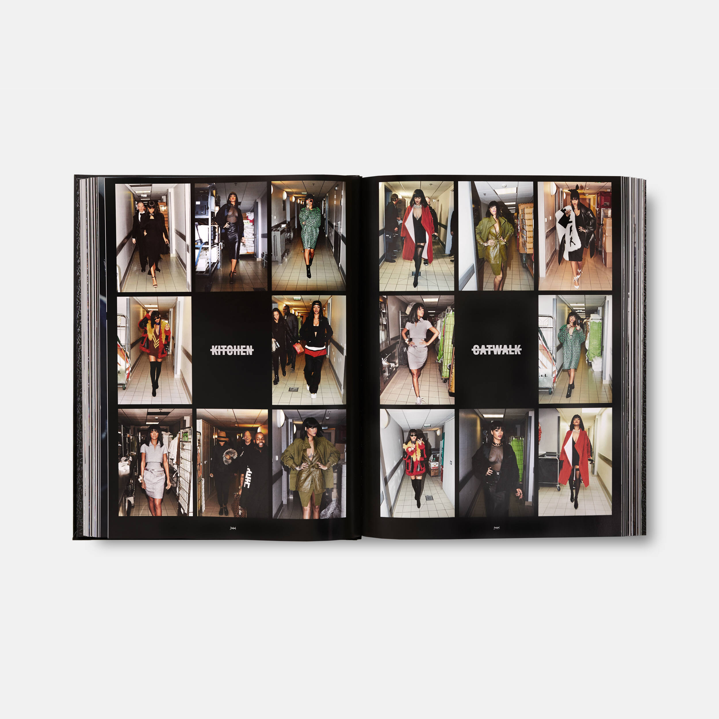
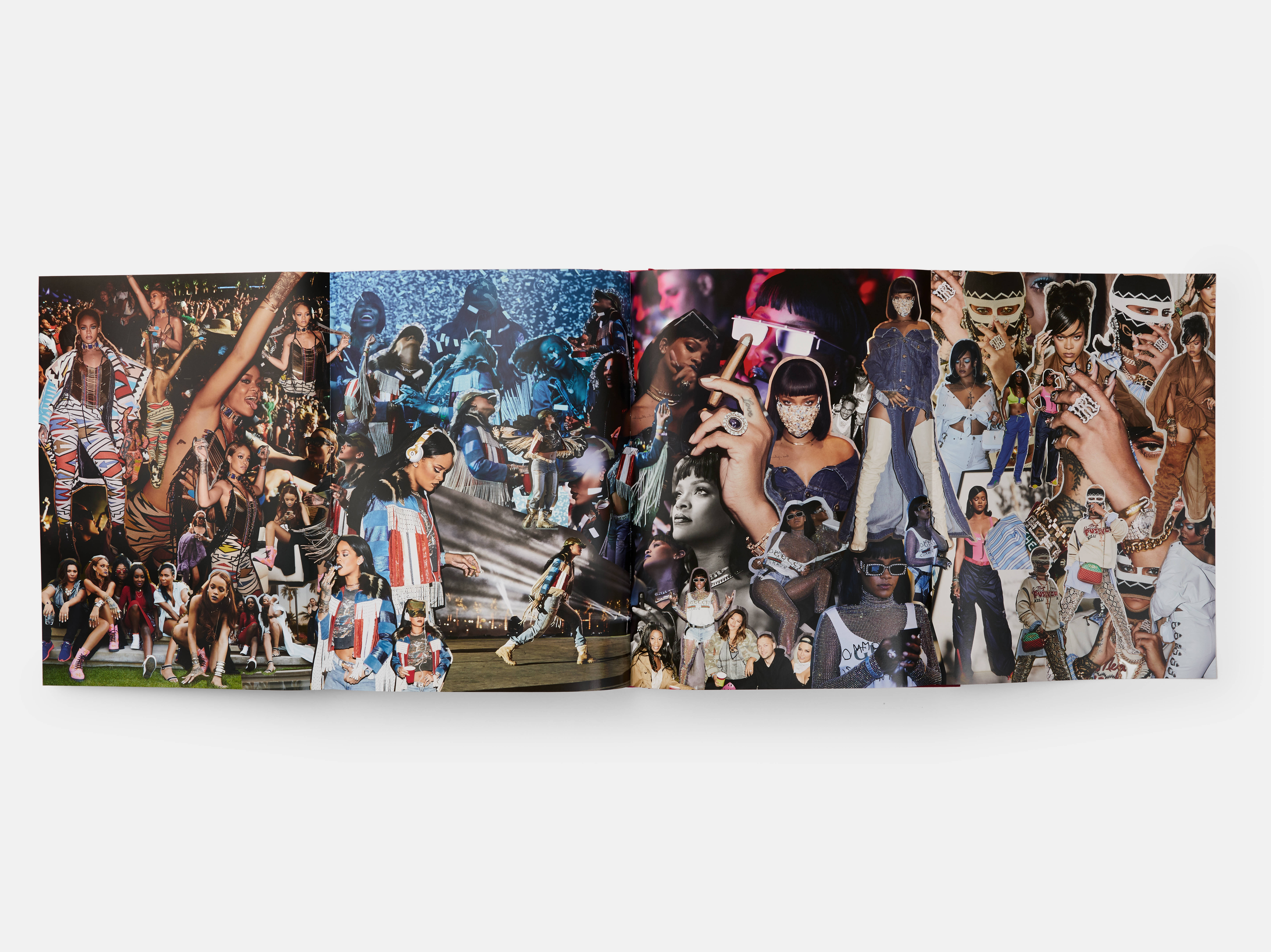
The ‘disruptor’ pages are a smart idea. What inspired them? Marwan: “Phaidon and Rihanna’s team weren’t very excited by the idea of repeating the fact that she went to say the Grammys in 2015, and 2016 and also in 2017. So, we came up with the idea of putting these repeated events in her life together and using them to break up the book so that they became organic separators, disruptors as you say. We explored different options for this. But eventually I kind of went back to something that I would do when I was a kid when I had scrapbooks, and I would cut out pictures of singers from magazines and paste them up. And even though I wasn’t really thinking about it at the time, when I was doing the collages it was really like making a fan’s scrapbook. That’s where the inspiration came from to keep things more interesting and provide different visual moments as you’re going through the book.”
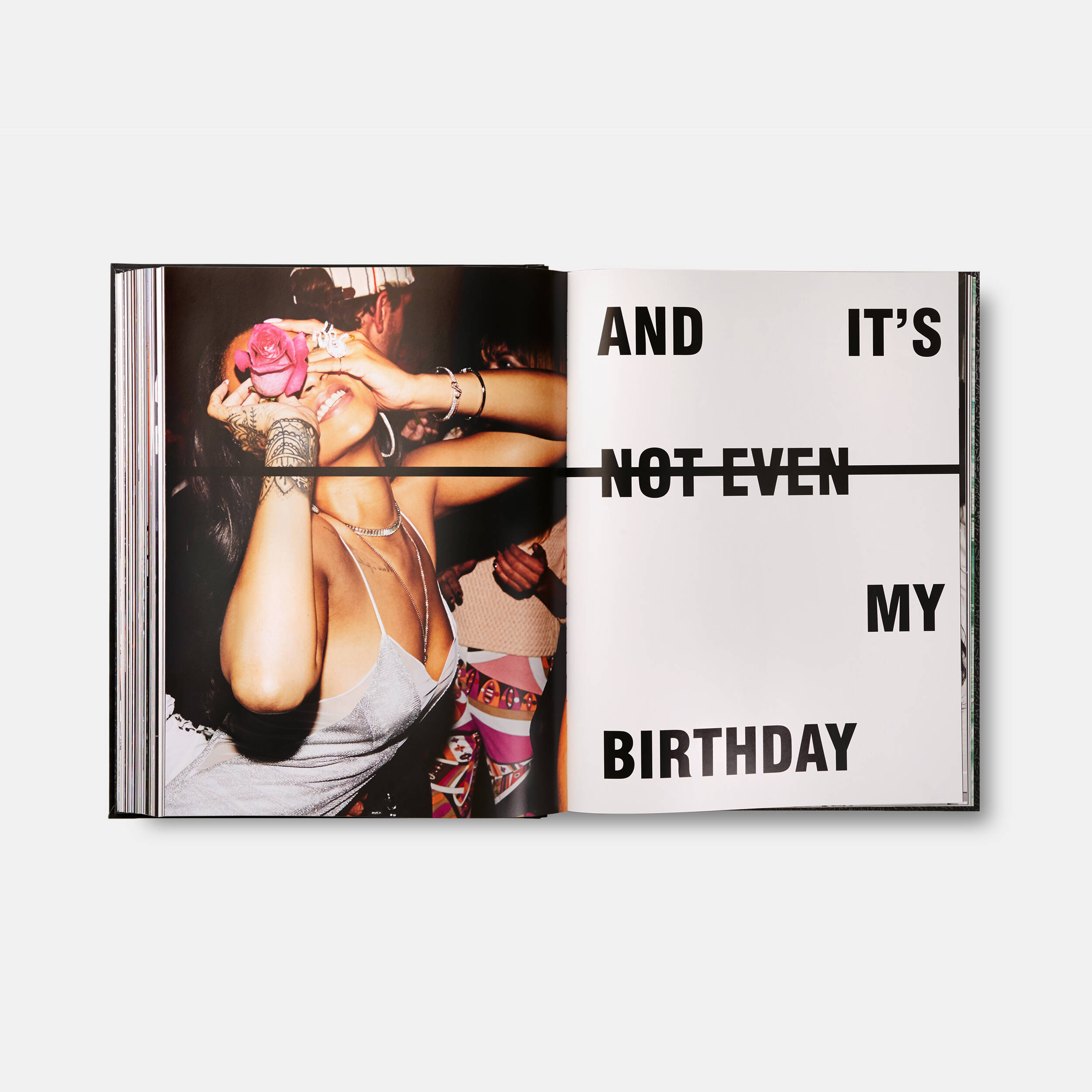
Barnbrook Studio is known for its innovative use of typography. How did you eventually settle on the dramatic strike through typeface? Marwan: “As you can imagine we went through a lot of different options throughout the process. In the end, we settled on this particular one for a number of reasons. One of the main reasons is that it evokes Rihanna’s very energetic attitude and her presence in popular culture. In one way, the line evokes a censorship bar, or the striking out of something. The idea of strike-through text is us playing on the idea of what’s being said versus what is not being said. So, it has a conceptual depth to it.
“Meanwhile, from a graphic point of view, what the studio has developed is a flexible system. So, you have the letters of a word or a phrase that are aligned throughout this line that can be compressed and can occupy different spaces. The consistency of that typography goes from the beginning to the end. It plays on this idea of what’s been crossed out and what’s not crossed out. So, a lot of components went into the making of something that looks quite simple but is, hopefully, quite effective.”
Did you look to other photography books for inspiration? Marwan: “Rihanna has so much in her universe to look at that it was enough for us to use that as our starting point, rather than shift our focus somewhere else. The huge pool of material was very much the inspiration. But we did look at books that provided an alternate way of looking or reading; books that had tip-ins and inserts and fold-outs. We were looking at them as ways of expressing the narrative, more than for aesthetic inspiration.”
A lot of the commentary around Rihanna often refers to the connection she has with her fans. How did you convey that? Marwan: “That’s very true and connected to that is the fact that a lot of the text was extracted from phrases or words or hashtags that she uses when she communicates with her fans. During the process we were going through Instagram and trying to find those words that are very much her voice and that her fans would connect to. And that has very much made its way into the fabric of the book.”
Jonathan: “Whether it’s a record cover or a book, you have to be into the artist and when somebody isn’t, then it does show. And it’s the same with this book. I think what the design shows is that Marwan LOVES Rihanna! He went through all the Instagram stuff because he loves the artist. That connection is really important.”
Marwan: “It just happened that I was a huge fan. She’s my age and I’ve been following her music since she came out. So, this ended up as a really lovely coincidence for me.”
Did the fact that you were a fan make the project more daunting? Marwan: “At the beginning, obviously it’s a little bit daunting working on something of such scale and cultural impact, but then you soon find out that the most rewarding thing you can do as a designer is tap into your interest, the thing that intrigues you about the subject matter. And I don’t know if it shows in the book design, but it was those details that I was looking at from a very personal perspective that kind of weave together the graphic language of the book.”
Jonathan: “I think it’s more the interest spurs the desire to do a really good job. And what’s amazing about the book is the editorial focus. All the photos work together to make one big, long journey. But there’s enough to make you stop along the way. And I think that’s what Marwan has brought to it, not just visual mark-making, but a selection of visual images, and pacing and contrast which comes from a love of the artist and also comes from being a good designer.”
Did you have an idea of where the design might possibly go before seeing the huge amount of imagery that makes up the book? Marwan: “In the beginning we just had a hard drive with a ton of images and our aim was to create a sense of narrative and then the text at some point seemed like a very natural companion to the images. We quickly realised we needed not just timid caption-style typography at the bottom of a page, we needed something that is much more vocal – like she is. That’s when the idea of having a typographical element that is very much at the forefront of the design began to lead us.”
Jonathan: “Something that’s fundamental to the typography of this studio actually is this idea of making a mark on paper but also negating it as well. It’s the same thing with a personality. Whether it’s Rihanna or somebody else, it’s all about that person. So, you’re making this bold statement but you’re taking something away as well. You have to have something to link all the pages, about the idea of shock and the negation of personality as well. Whether it’s an album cover or whether it’s a book, there has to be a central theme to link everything together. I hate calling designs like this a branding project, but it has to work conceptually first.”
How did you decide on the correct ratio of different paper stocks, tipins, and fold-outs? Marwan: “It had to be the right amount for it to remain an exciting and layered and complex object without it becoming too disruptive. We didn’t want to interrupt the viewer every other page. In the end it was just a case of exhausting all the different options and going through them until we decided on the right amount. It was very much a dialogue.”
Once the visual design for the book was set, it was time to look at the various production techniques needed to bring the project to life. Sue Medlicott was the production guru tasked with overseeing the complex production process needed to bring all the elements together into a beautiful, luxurious, oversized format book.
“The large size restricted how much can be done by machine, so a great deal was assembled by hand,” Medlicott says. “The actual cases were all made by hand because there is no machine big enough to do what we required.”
“It takes four or five people working on each book to carry out the various steps: gluing, cleaning, aligning everything to the degree we need. It’s very time consuming. It takes between three and four days to make one book. The book is then also covered with a very special fabric called Vanta and it has to be handled – literally – with kid gloves. This material was found by the Los Angeles-based artists the Haas Brothers, Nikolai and Simon, who designed the end papers for the book. It’s a material used for high-end sneakers. When Rihanna saw it, she wanted it."
The paper stock was created by the 150-year-old Japanese paper company Oji, and the endpapers feature a custom design by The Haas Brothers, in spot gloss on a rich, black paper stock. “One of my favourite parts of the book are the endpapers, which have a print of the vermiculation pattern in clear gloss over black paper,” Simon Haas says. “It shimmers almost like a spider web. And it has Rihanna’s name hidden in it. It's really beautiful.”
Take a look at Love, Rihanna: Luxury Supreme and Luxury Supreme edition in the store.